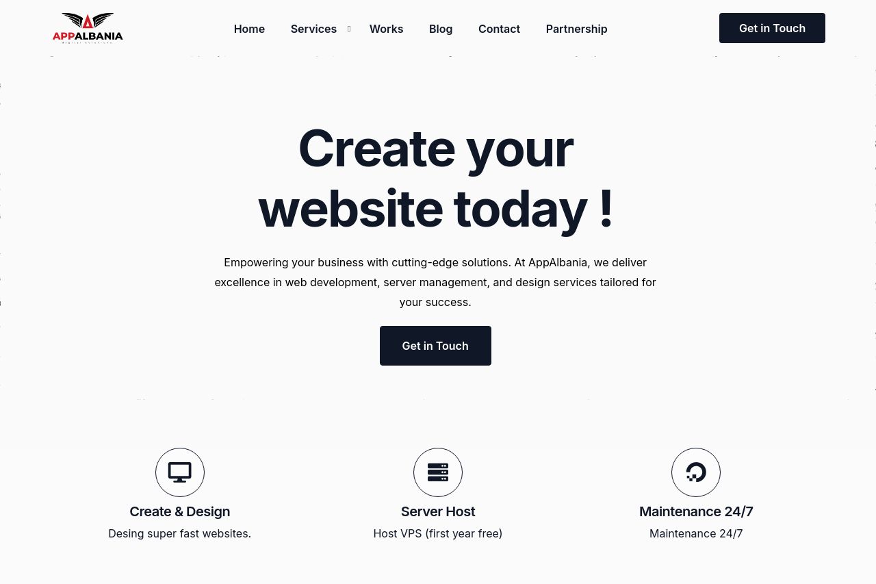
appalbania.com
Landing Page Analysis
Web Agency Your trusted partner for website development, digital marketing, business solutions, and custom systems. Empower your business with innovative tools and expert services.

Summary:
The landing page of AppAlbania is trying too hard to be everything at once, which ends up diluting its impact. The design is decent and the colors are calm, but it's not particularly memorable or unique. The value proposition reads like generic marketing fluff, without clearly pinpointing what makes the services stand out.
The readability is decent, but the text gets drowned out by the sameness across sections. Information feels cluttered, like it's trying to bombard the visitor with too much in one go without a clear journey. Testimonials or social proof are scattered, providing a sense of credibility, but they lack depth.
The CTAs are all over the place, barely distinguishing themselves from regular text, which can confuse and disengage users. Some sections are filled with jargon and buzzwords, which may not resonate well with all prospective clients. Overall, it’s trying, but it's got a lot to work on if it hopes to truly stand out in a competitive agency market.
- Clarify and simplify the core value proposition to differentiate from generic offerings.
- Redesign CTAs to stand out more and guide user action effectively.
- Structure content to lead users on a logical journey rather than overwhelming them up front.