itattoo.com
Landing Page Analysis
iTattoo Software helps tattoo and piercing studios streamline bookings, manage clients, and automate daily tasks. Save time and grow your studio.
Summary:
The landing page for iTattoo largely succeeds in its targeted messaging towards tattoo and piercing studios, making it apparent what the software does and who it's for. There is clear emphasis on differentiating the software from simpler calendars, positioning it as an essential business tool. However, the value proposition isn't as powerful as it could be, with some repetition and a lack of truly convincing statements.
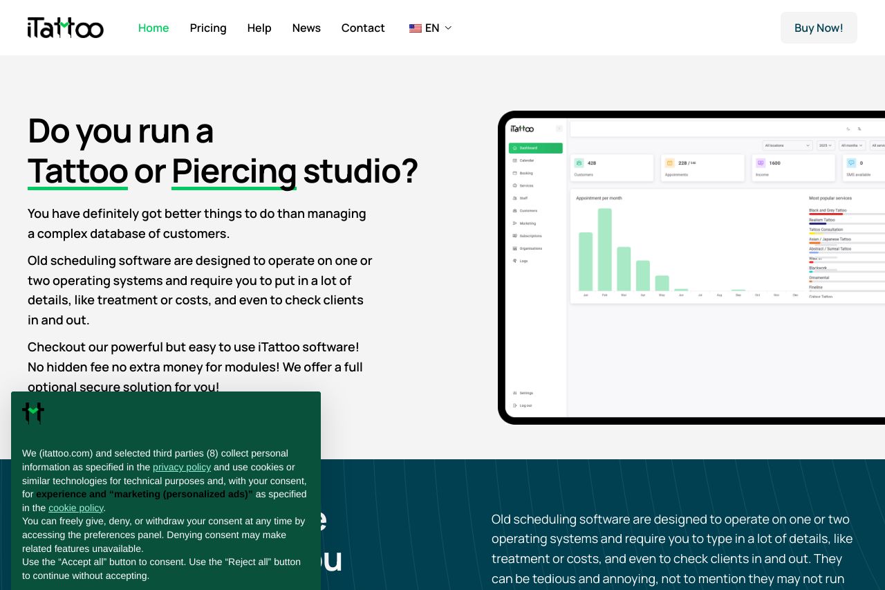
Visually, the page maintains a professional look, with a consistent color scheme that complements the brand. However, the CTA elements don't stand out as much as they should, and the long cookie consent overlays are distracting and visually unappealing.
The structure is logical but could be improved by enhancing the visual hierarchy, especially in terms of headings and sections. The readability of the content is decent, but there could be more breaks and emphasis on key points to aid skimming.
Credibility is bolstered by various features listings like multilingual support and automation, yet there's a lack of visible customer testimonials or recognizable client logos, which should be leveraged more to convey trust.
- Enhance CTAs with more contrast and action-oriented language.
- Utilize customer testimonials or recognizable client logos.
- Reduce the size or improve the design of the cookie consent pop-up for better UX.