achievetutorials.com
Landing Page Analysis
Exceptional private SAT tutoring online. Our tutors have more than 10 years of experience helping students maximize SAT scores.
Summary:
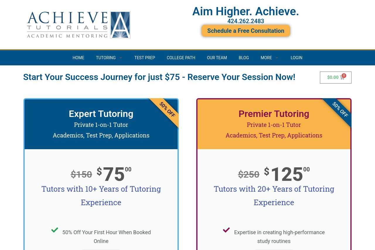
The landing page is a mixed bag. The headline "Aim Higher. Achieve." is boring and doesn't communicate the unique value of the tutoring services. The pricing section is somewhat effective but visually cluttered and overly text-heavy. The fonts are plain, lacking any exciting elements that grab attention. The tone is decent, maintaining professionalism, yet it borders on being too dry for a landing page aiming to attract parents looking for tutoring services for their children. The call to actions (CTAs), "Book Your Expert Session Now" and "Free Consultation", are clear but visually blend into the page, making them easy to overlook. The testimonials are a nice touch for credibility but are not highlighted enough to make a significant impact. On the positive side, there is a consistent color scheme that doesn’t distract from the central message, but it also doesn’t pop. Overall, the user journey feels somewhat linear, yet it could benefit from a bit more engaging, interactive elements to hold interest.
- Enhance the main headline to be more engaging and highlight the unique value proposition.
- Simplify and declutter the pricing section for better readability.
- Make CTAs more visually prominent to stand out.
- Add interactive elements or visuals to break up the text-heavy sections.
- Emphasize testimonials or social proof elements for more impact.