anwaryou.de
Landing Page Analysis
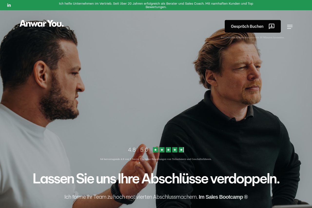
4.8 | 5.0
Summary:
Overall, the page does a solid job in communicating its purpose but lacks some fine details in user experience and design execution.
The messaging is straightforward, clearly communicating the effectiveness and credibility of the sales bootcamp through testimonials and experience highlights. However, the differentiation of sections relies too heavily on text without enough visual cues. Readability is somewhat compromised by the large blocks of text and minimal use of formatting to break it up.
Design-wise, there’s an attempt to keep things professional with a consistent color scheme, mostly leveraging green. However, the contrast and hierarchy could be improved to ensure that the most critical elements stand out. Some sections, like the testimonials, could benefit from more engaging placement and sizing.
Structurally, the information is presented logically, but the navigation could use improvement, particularly in making content more skimmable with better use of headings and visual contrast. Actionability is somewhat generic, with CTAs that don't always stand out as much as they could, and the visual focus might accidentally divert user attention away from the main goals.
Lastly, the credibility is well established through explicit customer testimonials and ratings, providing a good trust factor, but could further benefit from showcasing more explicit case studies or achievements.
- Improve typography by increasing contrast and using more headings for easy skimming.
- Enhance CTA buttons to make them more prominent and action-oriented.
- Differentiate sections with more visuals or dividers to break up text-heavy areas.