pipeorganmap.com
Landing Page Analysis
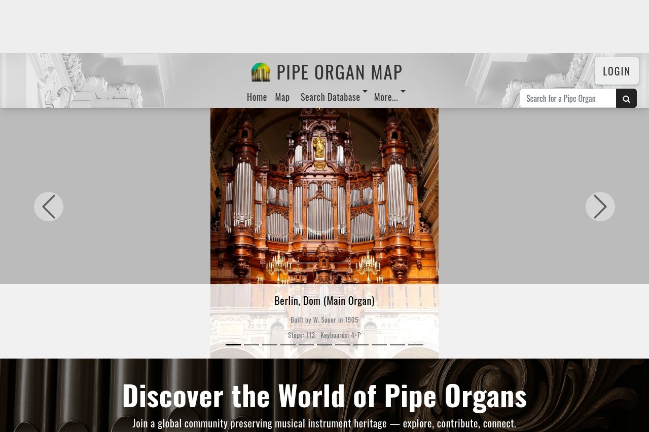
Discover and explore pipe organs around the world with our free interactive map and growing database. View stoplists, photos, recordings, and builder info — and help us build the world's most comprehe
Summary:
This landing page is underwhelming at best.
The main problem with this page is that it doesn't say loudly and clearly what it's doing here. The value proposition is either buried or just absent, making it hard for a visitor to appreciate the service. It looks like the designer had a visual hierarchy in mind, but it quickly falls apart with text that blends into the background and images that don't do enough talking. There's some bold text here and there, but it feels like an afterthought, not a strategic emphasis on key information.
For readability, there's not much good to say. While the text isn't riddled with jargon, it's not exactly engaging either. The layout let's everything just blend together, flat like a failed souffle.
Design-wise, this site could do with a hefty dose of creativity and consistency. There's a certain blandness to its palette, and none of the elements tie together cohesively, making it feel more like a patchwork quilt than a crafted piece.
In structure, the information is thrown at the user with no real prioritization or sensible navigation. It's almost daring users to leave the page in frustration.
As for the call to action, it's missing! A website existing without a clear next step is like a car without an engine. Where's it expected to go?
Credibility aspects could definitely brighten up this grayscale project. Adding trust badges, testimonials, or just a bit of professional flair would go a long way.
- Clearly state the main value proposition and benefit to the user from the start.
- Introduce a clear call to action, guiding the user on what to do next.
- Improve visual hierarchy with better use of font sizes, bold text, and color contrasts for emphasis.
- Add trust elements like testimonials or client logos to boost credibility.
- Revamp the design for cohesion and appeal, maybe choose a more interesting color palette.