superduty.app
Landing Page Analysis
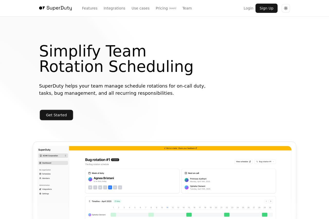
Manage schedule rotations easily
67
Share on:
Summary:
65
Messaging
80
Readability
60
Structure
50
Actionability
65
Design
60
Credibility
SuperDuty's landing page does a decent job of clearly communicating its main purpose: to simplify team rotation scheduling. The imagery supports this by providing a screenshot of the interface. However, there's a lack of compelling design that attracts and engages users, making the site feel a bit bland and uninspired. Headings are strong and well-defined, but the lack of pricing details and a visible demo or more interactive elements negatively impacts the structure and usability. Text is concise and mostly easy to read, but it fails to create an emotional connection or urgency for users to engage. Overall, while functional, this landing page doesn't do enough to stand out or demand attention.
Main Recommendations:
- Add pricing information to give a complete picture.
- Incorporate interactive elements or demos for better engagement.
- Enhance the visual design to make it more engaging.