rendery3d.com
Landing Page Analysis
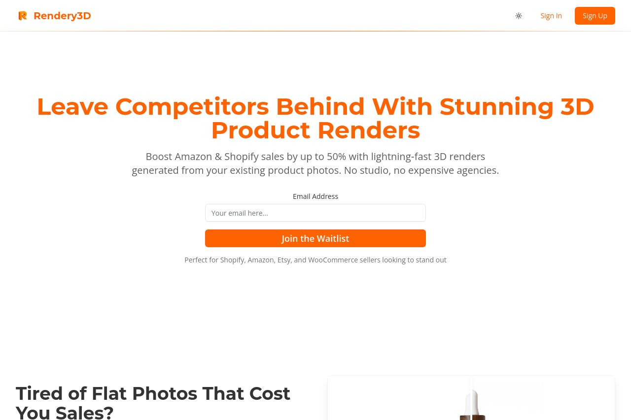
Rendery3D is a powerful platform that converts your 2D product images into photorealistic 3D renders. Enhance your product visualization with our easy-to-use automated rendering solution.

Summary:
**Rendery3D's landing page does an impressive job in communicating its core value proposition to potential customers – providing 3D renders to e-commerce sellers to increase sales. The call-to-action buttons are bold and engaging, urging users to join the waitlist. Key benefits and features are displayed clearly, with helpful visuals supporting the text.
However, the page lacks a bit of uniqueness, as it keeps repeating certain elements like CTAs, which can dilute their impact. The color scheme mostly works, but with so much orange everywhere, it could use more visual breaks. Language is generally tailored well to the audience, although in some areas it's a bit too broad and not as punchy as it could be. The layout effectively guides users through the content, though the sheer amount of information might overwhelm first-time visitors.**
- Consider diversifying the CTA to prevent dilution of its impact.
- Reduce the use of the same color to create more visual breaks.
- Refine the language to be more targeted and specific to the audience.