dataextractorai.com
Landing Page Analysis
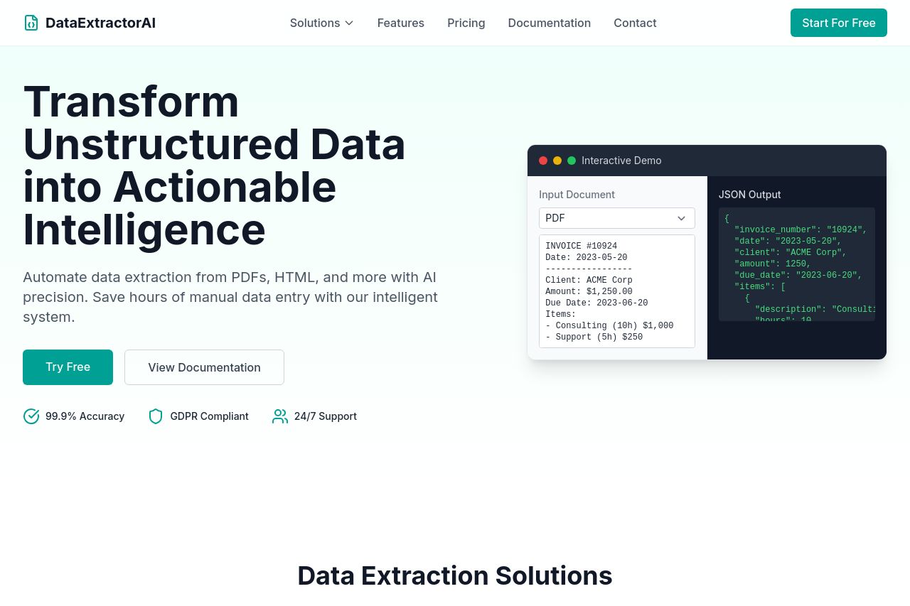
Automate data extraction from PDFs, HTML, and more with AI precision
Summary:
DataExtractorAI's landing page does its job of communicating what the product does, but it could be streamlined further. The hero section successfully communicates the key value proposition: transforming unstructured data into actionable intelligence. However, there's a lack of urgency or strong push towards conversion, despite having a prominent CTA.
The design is clean but feels a bit monotonous. A more dynamic use of color contrast could break the uniformity and highlight key sections like CTAs or main benefits. The minimalistic approach helps readability, but opportunities for more engaging visuals are missed.
Sections such as 'How It Works' and 'Try It Yourself' use visual elements to assist understanding, though they could definitely use more interactive or attention-grabbing elements to boost user engagement. The wording is generally clear, but often leans heavily on technical terms that could alienate a broader audience.
Overall, the page does a decent job in presenting features and use cases but suffers from an overly generic tone that might not deeply resonate with potential users.
- Increase the sense of urgency in CTAs to drive conversions.
- Use more vibrant colors to highlight key sections and CTAs for better engagement.
- Simplify technical jargon to make it accessible to a broader audience.