abycash.com
Landing Page Analysis
Make money online with AbyCash! Complete tasks, surveys, and earn free Bitcoin, cash, or free Amazon gift cards. Fast cashout to PayPal, Bitcoin, or Gift cards.
Summary:
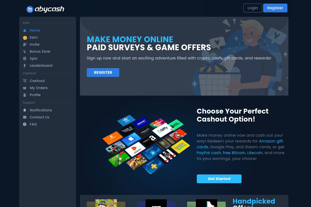
The landing page for AbyCash aims to promote an easy and rewarding way to make money online through surveys and offers. The main value proposition is clear right off the bat. The promise of rewards like cash, gift cards, and cryptocurrencies is visually reinforced by imagery. However, it feels overly generic with typical incentives and lacks any unique selling points or differentiation. The color scheme is mostly cohesive with a focus on blue tones, but it lacks variation, which makes some elements blend together too much. The CTAs are prominent but repetitive, potentially losing user interest and urgency. The navigation is straightforward with logical sections, but the content needs a bit more hierarchy to guide users through the benefits explicitly. Overall, it feels a bit like a standard template without distinct personality or innovative features.
- Highlight unique features or benefits to differentiate from competitors.
- Use more varied and strategic colors to make crucial elements stand out.
- Improve the visual hierarchy so users can easily scan through the benefits and features.
- Add testimonials or reviews to build credibility and trust.
- Make CTAs more varied and enticing to encourage specific actions.