predictmodel.ai
Landing Page Analysis
Lovable Generated Project
Summary:
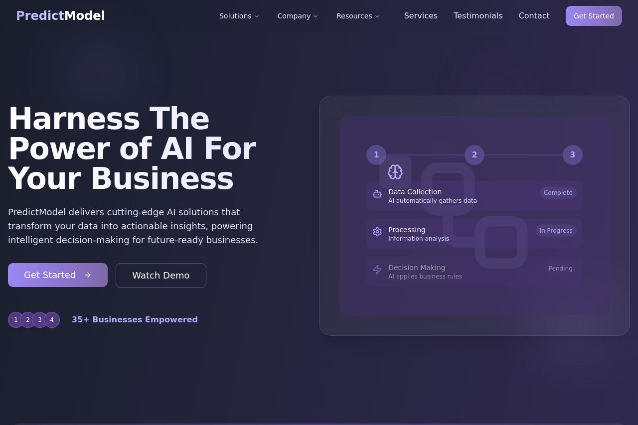
The landing page for PredictModel boasts a sleek and professional design with a consistent dark theme and clear typography. However, it tends to fall into the trap of being overly generic and lacking specificity in its messaging. The main value proposition is somewhat clear but could do a lot more in terms of explicitly defining the audience and highlighting use cases. While the site uses visuals effectively, the overall design could benefit from better contrast to make key elements pop, such as CTAs which don't stand out as much as they should.
The layout maintains a logical order, but it can feel a bit busy with too many sections crammed full of text that might overwhelm the user. It does well with social proof, featuring testimonials and client logos, but could include more innovative interactive elements to engage the user further. The navigation is clear, but heading distinctions could be enhanced to make skimming easier.
The tone is professional, yet it misses some emotional engagement, which could help in resonating more with potential clients. The Open Graph details are poorly aligned with the brand, creating confusion, and really need a redo to match the polished nature of the website.
- Revamp the Open Graph title and description to better reflect the AI business context, avoiding generic phrases not relevant to the brand.
- Enhance CTAs by using contrasting colors and more action-oriented text to improve visibility and engagement.
- Improve messaging clarity by including specific use cases and benefits prominently for different audience segments. Add real-world examples to create a better connection.