lovable.app
Landing Page Analysis
Professional laser etching services for metal, wood, glass and more. Transform your ideas with our precision laser technology.
Summary:
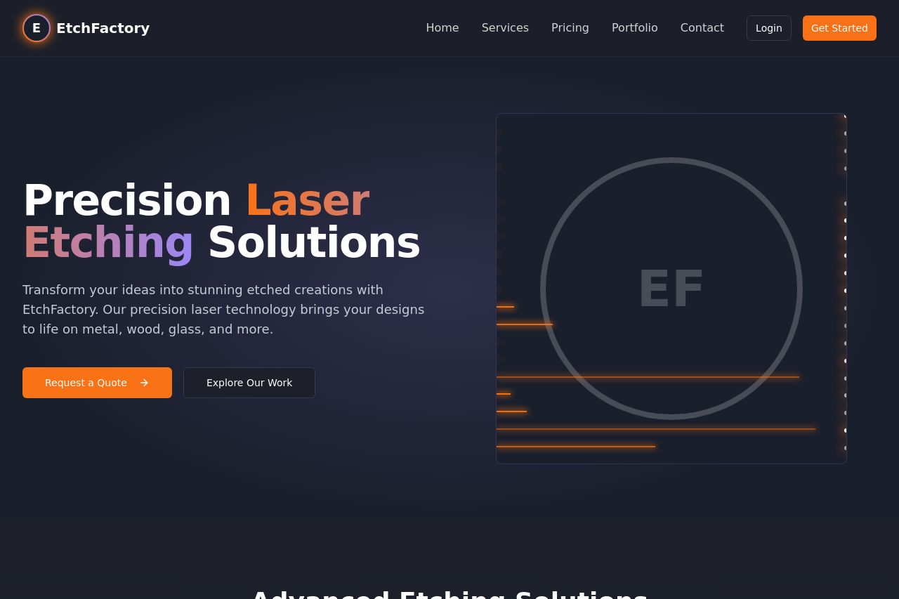
The landing page for EtchFactory mostly gets the fundamentals right but struggles significantly in some areas. The hero section clearly communicates the value proposition of precise laser etching solutions, which is repeated effectively. However, repetition throughout the rest of the page is a double-edged sword; while it keeps the messaging consistent, it makes the content feel a bit monotonous and uninspired.
The design elements, like color choices, align well with the theme of technology and precision but come off a bit dull due to lack of vibrancy or unique visual aspects. Although the text is generally easy to read, the visual contrast across the page could use more dynamism to engage the users more effectively.
CTAs are generally action-oriented and placed at strategic points, but they suffer due to the lack of urgency or compelling unique propositions, making them easy to gloss over.
Where the page shines is in its structured layout and logical flow; users are eased from basic information into more detailed content naturally. The inclusion of social proof and transparent pricing further establish credibility.
Overall, while the basics are solid, the page lacks the excitement or distinctive elements to really engage and captivate the user.
- Improve the vibrancy and contrast of colors to make the page more engaging.
- Add unique imagery or graphics to break the monotony of text-heavy sections.
- Include urgency or scarcity in CTAs to make them more attention-grabbing.
- Diversify the type of CTAs used to maintain user interest and drive conversions.