salespopup.io
Landing Page Analysis
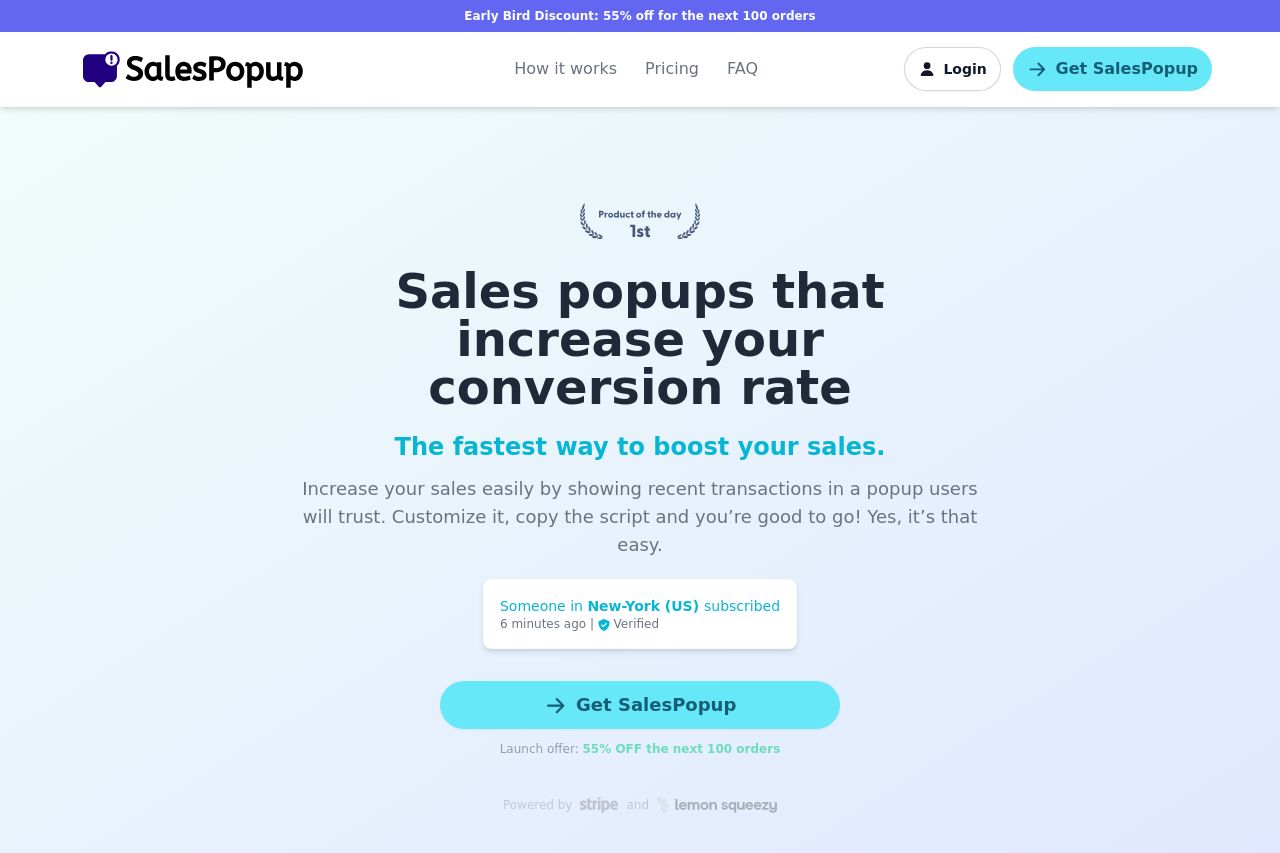
Increase your sales easily by showing recent transactions in a popup users will trust. Customize it, copy the script and you’re good to go! Yes, it’s that easy.
Summary:
The SalesPopup landing page is a visually clean and coherent experience with a strong emphasis on increasing conversion rates. The value proposition "Sales popups that increase your conversion rate" is clearly articulated right from the hero section, which is crucial for capturing attention. The bright CTA buttons, like "Get SalesPopup," are clear and action-oriented, though they could better emphasize urgency.
The visual and text hierarchy throughout is well-organized, but there are inconsistencies in design details that could be distracting. There’s redundancy in explaining the service's benefits, which could be condensed to avoid clutter. The "How it works" section is straightforward, though the visual elements don't enhance understanding as much as they could.
There’s substantial social proof, with real-time notifications and testimonials aiding credibility. However, while the testimonials are prominently placed, the design doesn't always feel polished and unique.
Readability is mostly intact but hindered by occasional jargon and longer text blocks. Imagery is supportive but lacks dynamism in some areas.
Overall, it's a decent page, but there's room for refinement in content articulation and design to enhance professional authority.
- Improve design consistency, focusing on cohesive fonts and colors.
- Enhance CTA urgency by emphasizing scarcity more boldly.
- Condense some text sections to avoid redundancy and improve clarity.