kindlebridge.app
Landing Page Analysis
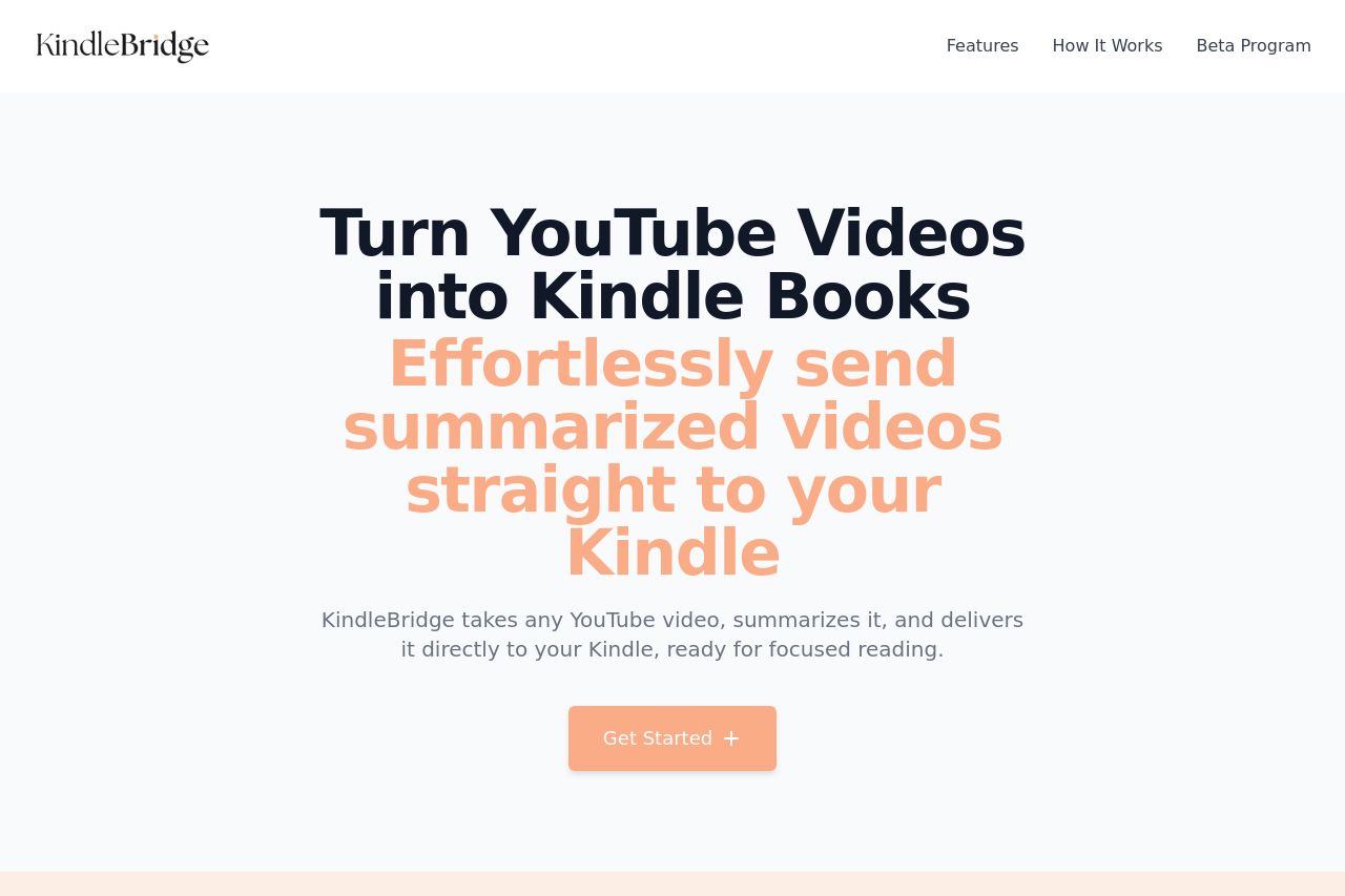
KindleBridge transforms content from various sources into Kindle-compatible formats and automatically delivers them to your device, helping you escape the scroll and focus on what matters.
Summary:
The landing page for KindleBridge is generally solid with a clear value proposition: turning YouTube videos into Kindle books. The headline immediately tells visitors what the product does, and the supporting text explains the benefits of using the service. The sequential steps provided for getting started are clear and make the process user-friendly. However, the design could be better in terms of visual hierarchy and color contrast. The colors chosen for the call-to-action buttons stand out, but the overall color scheme can seem too pastel and doesn't contrast enough, potentially impacting readability. Additionally, credibility is lacking with no testimonials or social proof elements that could enhance trust in the service. The page effectively communicates its features, but the overall tone could also be more engaging to better connect with the audience.
- Improve the color contrast for better readability.
- Add testimonials or reviews to enhance credibility.
- Use a more engaging tone to better connect with the audience.