writeconv.com
Landing Page Analysis
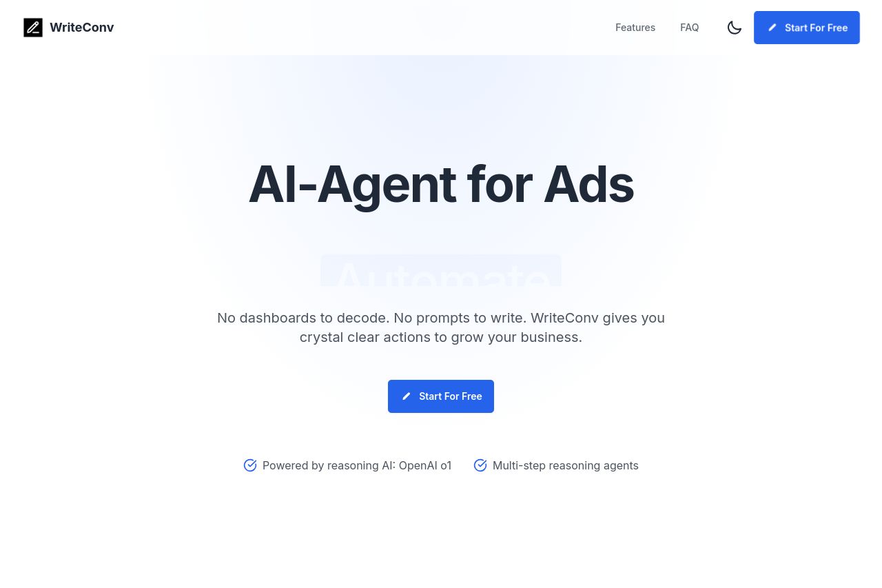
Transform your ad campaigns with AI-powered optimization. Our deep reasoning models analyze your Ads data and deliver actionable reports, helping you maximize ROI without spending hours on dashboards.
Summary:
The landing page for WriteConv does a decent job at maintaining a clean and professional appearance, but there are several areas that could use some tightening up to better align with the B2B SaaS audience.
While the core value proposition of an "AI-Agent for Ads" is stated upfront, it feels a bit vague and could be enhanced with more explicit detailing of exactly what the product does. The lack of specific audience mentioning makes it less targeted. They do a reasonable job communicating benefits but could emphasize specific features and use cases more clearly.
In terms of readability, the site doesn’t suffer from major readability issues, and it's visually simple - maybe a bit too simple. Text simplicity is fairly solid, but some elements come off as repetitive or too basic without enough tangible examples. The typography and layout are straightforward, but they could be spiced up to grab the reader's attention more effectively.
Design-wise, the page isn't confusing, which is good, but it does little to stand out or inspire action. There's a consistent application of headings and font sizes. However, the design could use more energy in how it uses colors to emphasize important information and calls to action.
Structure is okay at directing flow, but the information hierarchy is far from optimal. It seems cluttered in certain sections with blocks of text and list items that don't really add up logically. Some of the content is oversimplified for the target audience, which might need more convincing evidence or data-driven insights.
Actionability suffers because of some poorly placed and uninspiring CTAs. They're not as clear or engaging as they could be, nor do they optimally guide the visitor towards conversions throughout the journey.
Credibility lacks strong social proof. Without badges, recognizable logos, or a robust set of testimonials, trust-building feels limited. There are areas where adding testimonials or partnership logos could significantly boost user trust.
- Clarify the core value proposition with specific features and benefits.
- Enhance CTAs with stronger, more action-oriented language and better placement.
- Introduce more social proof - customer testimonies, logos, partnerships.
- Include specific use cases or demos to clearly showcase functionality.
- Use color more strategically to highlight key areas and guide focus.