desafioemagrecerdormindo.online
Landing Page Analysis
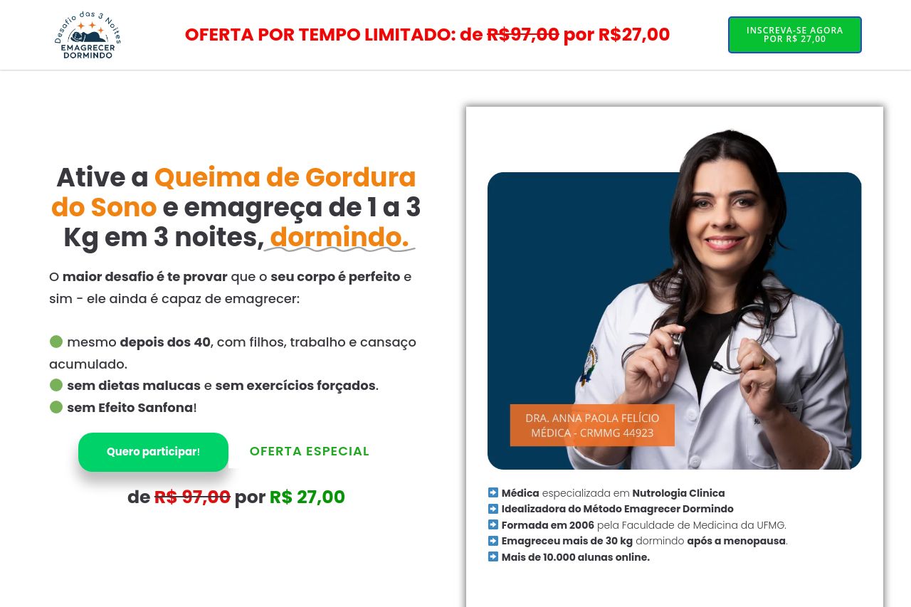
O maior desafio é te provar que o seu corpo é perfeito e sim - ele ainda é capaz de emagrecer: mesmo depois dos 40, com filhos, trabalho e cansaço acumulado. sem dietas malucas e sem exercícios forçad
Summary:
The landing page starts off strong with a clear emphasis on the special offer and its potential benefits. The bright colors immediately catch attention, but the overwhelming use of green, yellow and red for urgency can come across as overly aggressive. The structure allows for a quick understanding of what is being offered, supported by professional imagery of the doctor.
However, the text is lengthy in some areas, making it a bit of a drag for busy users. The benefits are outlined in a list, which is good, but it's missing any real proof or case studies aside from a few testimonials. Messaging is directed at women over 40, but the overall professionalism is slightly lacking due to the repetitive use of 'LIMITED TIME OFFER' banners, looking slightly gimmicky. Lastly, the CTAs are not as prominent or varied, which might limit engagement.
- Reduce the repetitive use of 'LIMITED TIME OFFER' to maintain credibility.
- Break down long paragraphs and simplify text for easier reading.
- Enhance CTA visibility with more strategic placement.