vercel.app
Landing Page Analysis
Scan and analyze food ingredients to make healthier choices. Get detailed health scores and ingredient breakdowns instantly.
Summary:
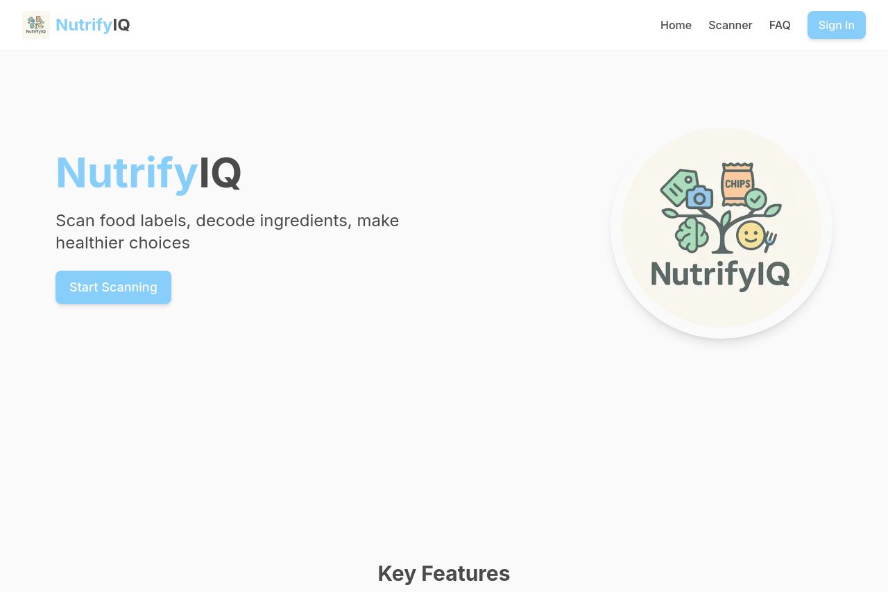
The landing page for NutrifyIQ is clean and straightforward, emphasizing ease of use and clear messaging. The hero section uses a simple and direct headline, but it lacks a strong visual impact to immediately draw the user's attention. The "Start Scanning" button stands out due to its contrasting color, but more emphasis on benefits and user needs could improve engagement. The "Key Features" section is well-organized, making it easy to skim through, but visuals could enhance understanding. The "How It Works" section is step-by-step, but the design is uninspired and lacks visual engagement. Adding icons or animations could boost this. Credibility elements like "Why Trust NutrifyIQ?" establish some trust, but the overall professional feel could benefit from stronger design work.
- Add more visual elements or animations for engagement, especially in the "How It Works" section.
- Enhance visual impact in the hero section with a more compelling image or background.
- Improve the design consistency for a more professional feel, especially in CTA placements.