omkardate.me
Landing Page Analysis
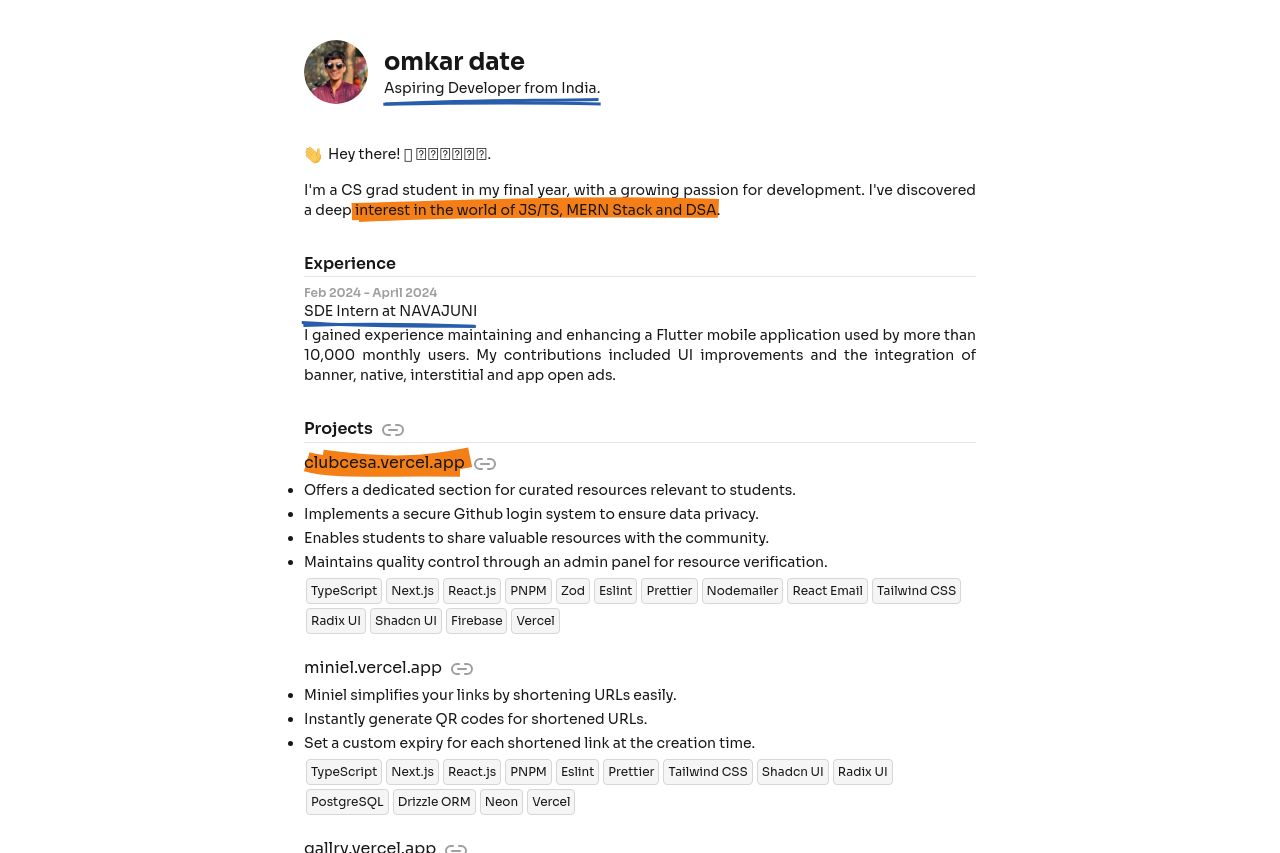
Welcome to the portfolio of Omkar Date, a Computer Engineer from India. As a versatile Developer, I specialize in cutting-edge technologies like Next.js, React.js, TailwindCSS, JavaScript, TypeScript,
Summary:
The page attempts to convey an aspiring developer's journey, focusing on skills and projects. It manages to be informative by listing various projects and skills but lacks a polished, professional finish. The overall design feels slightly inconsistent, with uneven spacing and a lack of visual emphasis that makes important elements stand out. Underwhelming CTAs don't effectively prompt visitors to act or explore further. The layout is too text-heavy, causing essential points to potentially get lost. Descriptions are somewhat jargon-heavy, not fully addressing a broader audience. Improvement is needed in visual hierarchy to make it more engaging and easier to digest for quick-skimming developers.
- Increase visual hierarchy by using different font sizes and bold text for important information.
- Add more engaging and specific CTAs to direct users toward actions like contact or portfolio views.
- Simplify the language and reduce jargon to ensure clarity and accessibility for a diverse audience.