jeannen.com
Landing Page Analysis
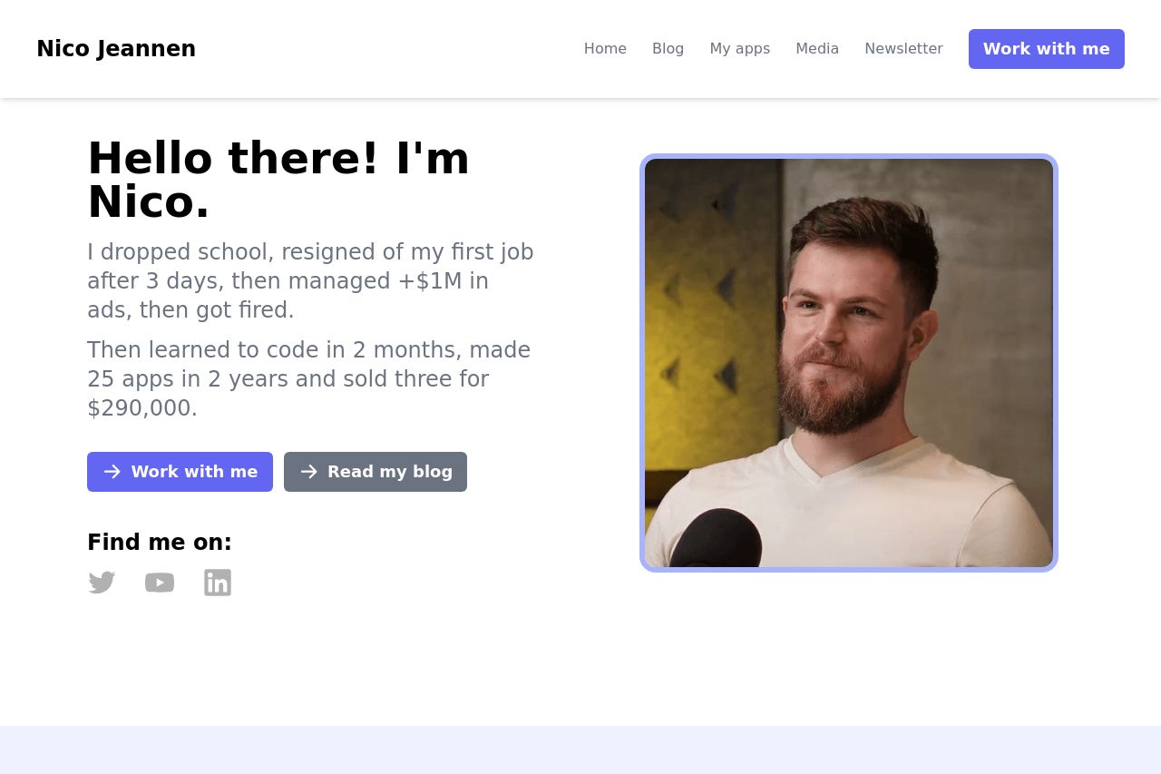
Hey, I'm Nico! I make stuffs on the internet. I sucks with code but I compensate by beind decent at marketing

Summary:
The landing page introduces Nico with a casual and personal touch, which is somewhat engaging but risks coming off too informal, especially with phrases like "I sucks with code." The color scheme is simple, and the design uses whitespace well, but it doesn't bring much excitement or innovation. The "Work with me" call-to-action is prominent, yet competing CTAs like "Read my blog" could confuse users about the primary action they should take. The project section provides some insights into products, which is good for a quick overview, but the lack of detailed descriptions leaves much to be desired. Overall, the tone resonates with the theme of a personal blog, yet fails to refine its message towards attracting professional opportunities, which might be the main point of such a website.
- Clarify the primary call-to-action to avoid confusion.
- Use a more professional tone to improve credibility, especially in the text.
- Provide more detailed descriptions of projects to better communicate their value.