lovable.app
Landing Page Analysis
Protect your enterprise network with continuous vulnerability scanning. Trusted by Fortune 500 companies for real-time threat detection and prevention.

Summary:
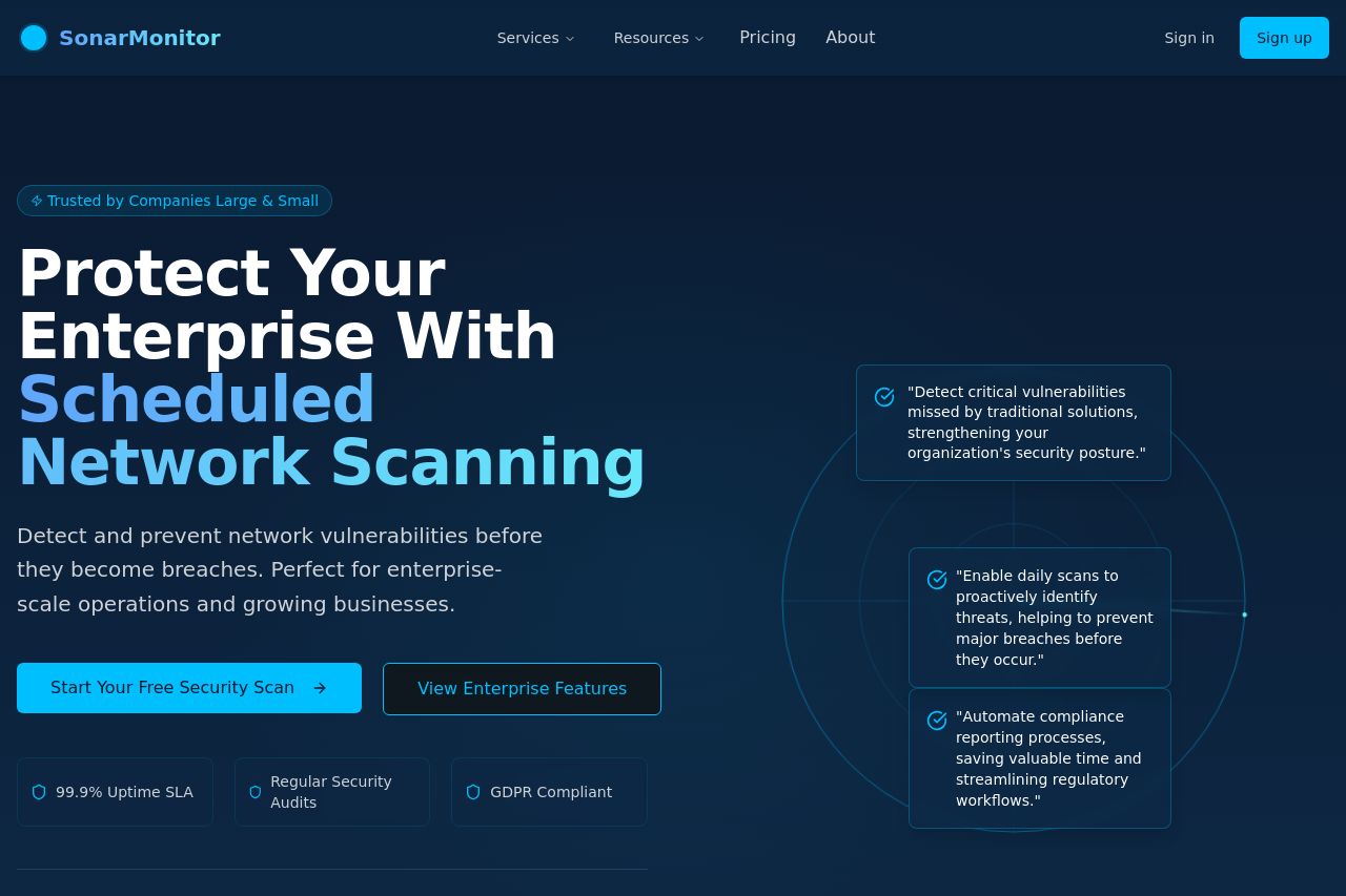
The landing page for SonarMonitor does a decent job in some aspects but falters in others. The hero section quickly communicates the main value: "Protect Your Enterprise With Scheduled Network Scanning," which is clear and direct. However, it lacks an explicit definition of the target audience except in vague terms like "enterprise-scale operations." The color contrast and typography are solid, making the text easy to read, but there’s nothing visually striking that captures attention. The CTAs are visible but hardly compelling, needing more action-oriented language or urgency to stand out. Social proof elements, like industry trust tags, give a boost to credibility, though this could be elevated with recognizable client logos or detailed testimonials. Structurally, the site follows a logical flow but misses depth in explaining unique selling points. Consistency in design is strong, though it borders on looking generic.
- Include detailed testimonials or recognizable client logos to boost social proof.
- Revise CTA text to be more action-oriented and urgent, such as "Secure Your Network Now."
- Define target audience more explicitly in the messaging, e.g., specific industries or business sizes.