simplybook.me
Landing Page Analysis
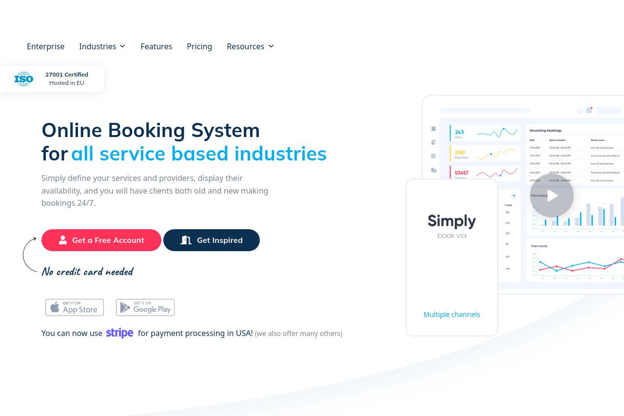
Online booking system. Booking website or widget for your own website. Let clients schedule appointments, get reminders and pay online 24/7. Free version!
Summary:
SimplyBook.me's landing page is functional but not without flaws. The value proposition is clear for an online booking system aimed at service-based industries, and the benefits are effectively communicated through features like payment integration, client apps, and custom options. However, it's quite generic and repetitive without emphasizing unique selling points, which dilutes the impact a bit. The design feels consistent, although a bit bland and lacking in distinctiveness. The CTA buttons stand out in terms of visibility, which is great, but the messaging could build more urgency or excitement. The cookie banner is overly prominent and annoying, cluttering the view and detracting from content. The page feels a bit text-heavy, and more visuals or interactive elements could break up the monotony. The social proof is well-done but sits a bit low on the page to be immediately impactful.
- Reduce the prominence of the cookie consent banner; it's too intrusive.
- Revise CTA text to include more active language and urgency.
- Incorporate more visuals or interactive elements to break up text-heavy areas.