vercel.app
Landing Page Analysis
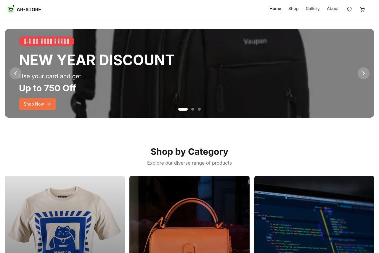
Shop authentic, handcrafted premium bags and accessories from Nepal. Featuring traditional designs, sustainable materials, and expert craftsmanship at AR-STORE.
Summary:
The landing page of AR-STORE provides an organized presentation of Nepali handcrafted bags and accessories. While the imagery and sections like "Shop by Category" and "Featured Products" are visually appealing, they lack depth and engagement due to a bland and uninspired layout. The "New Year Discount" banner is quite generic and could be more dynamic to grab attention. Product descriptions are brief and could benefit from more detail to better showcase craftsmanship. There's potential for improvement in the overall flow, making calls-to-action more compelling and visible. However, transparency is well-handled, with a clear contact section at the footer.
- Revamp the hero section with a lively and eye-catching visual to immediately grab attention.
- Enhance product descriptions to emphasize the unique craftsmanship and features.
- Improve the call-to-action buttons to be more actionable and standout.