netlify.app
Landing Page Analysis
NUBEA is an intuitive ERP system designed for small and medium-sized businesses.

Summary:
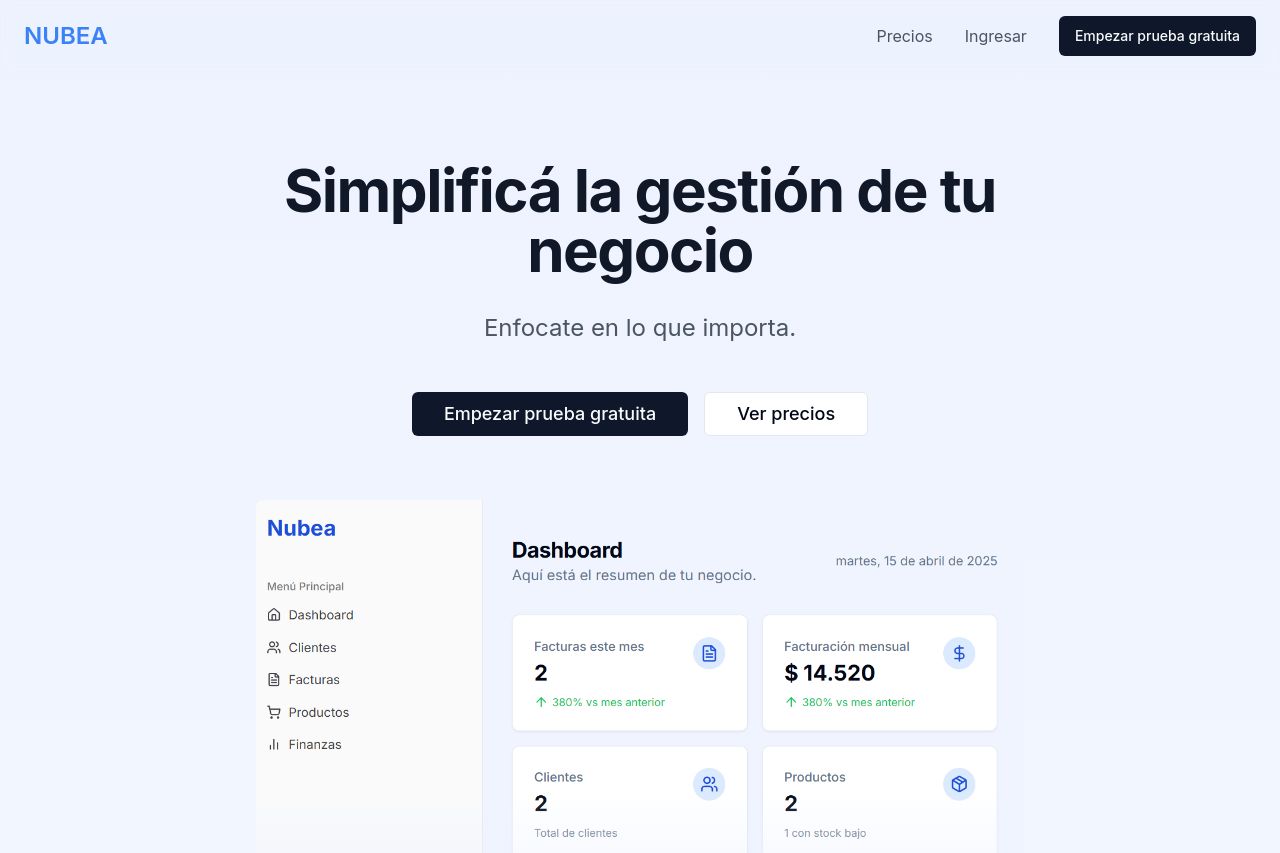
The landing page for NUBEA does a decent job in some areas but stumbles significantly in others. The main value proposition is clear and easy to grasp, but the page could benefit from more engaging visuals that better illustrate functionalities and features. Design consistency is mostly there, which helps maintain a unified look, but there's a lack of color dynamics, especially in CTAs that often blend with the rest of the text. The audience is not explicitly identified, which could alienate potential users unfamiliar with the product type. Typography is straightforward if a bit too boring, lending to readability but contributing a dull aesthetic overall. Lastly, the credibility elements are nearly non-existent — without trust badges or detailed testimonials, it makes trusting the platform more difficult for new visitors.
- Include more testimonials or client logos to enhance credibility.
- Highlight audience-specific features to better cater to the target users.
- Improve CTA designs to make them more visually distinct and engaging.
- Add dynamic visuals or video demos to better showcase the product.