di-trained.com
Landing Page Analysis
Increase the AI skills of your employees with trained. AI-supported training for AI literacy - efficient, flexible and practical.
Summary:
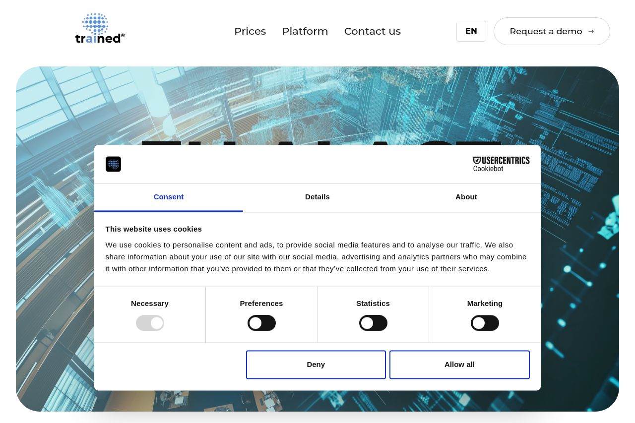
Overall, the landing page tries to communicate a clear intent of providing AI training solutions for companies needing to comply with the EU AI Act. However, it feels cluttered and visually overwhelming due to a prominently repeated cookie consent module.
The messaging attempts to directly address B2B clients, but it can be more precise in defining the value proposition and benefits. The text does communicate features but doesn't fully captivate or engage the target audience.
Design-wise, there are some issues with visual hierarchy and inconsistency. Important information doesn’t stand out well, making navigation seem harder. The color palette lacks contrast, hindering readability.
The structure is undermined by poor navigation and jumpy reading flow. Essential content can be hard to locate, and the user journey isn't optimized for conversion.
- Eliminate repeated cookie consent modules to reduce visual clutter.
- Refine the main value proposition to clearly state benefits.
- Improve visual hierarchy by emphasizing important information with font size and color contrast.
- Clearer, more action-oriented CTAs that stand out visually.
- Enhance text simplicity and break into more digestible pieces.