conos.hu
Landing Page Analysis
Overcome construction punch lists with ease! Conos Snagging Tool simplifies defect management, saving time and reducing rework. Identify, document, and resolve issues efficiently.

Summary:
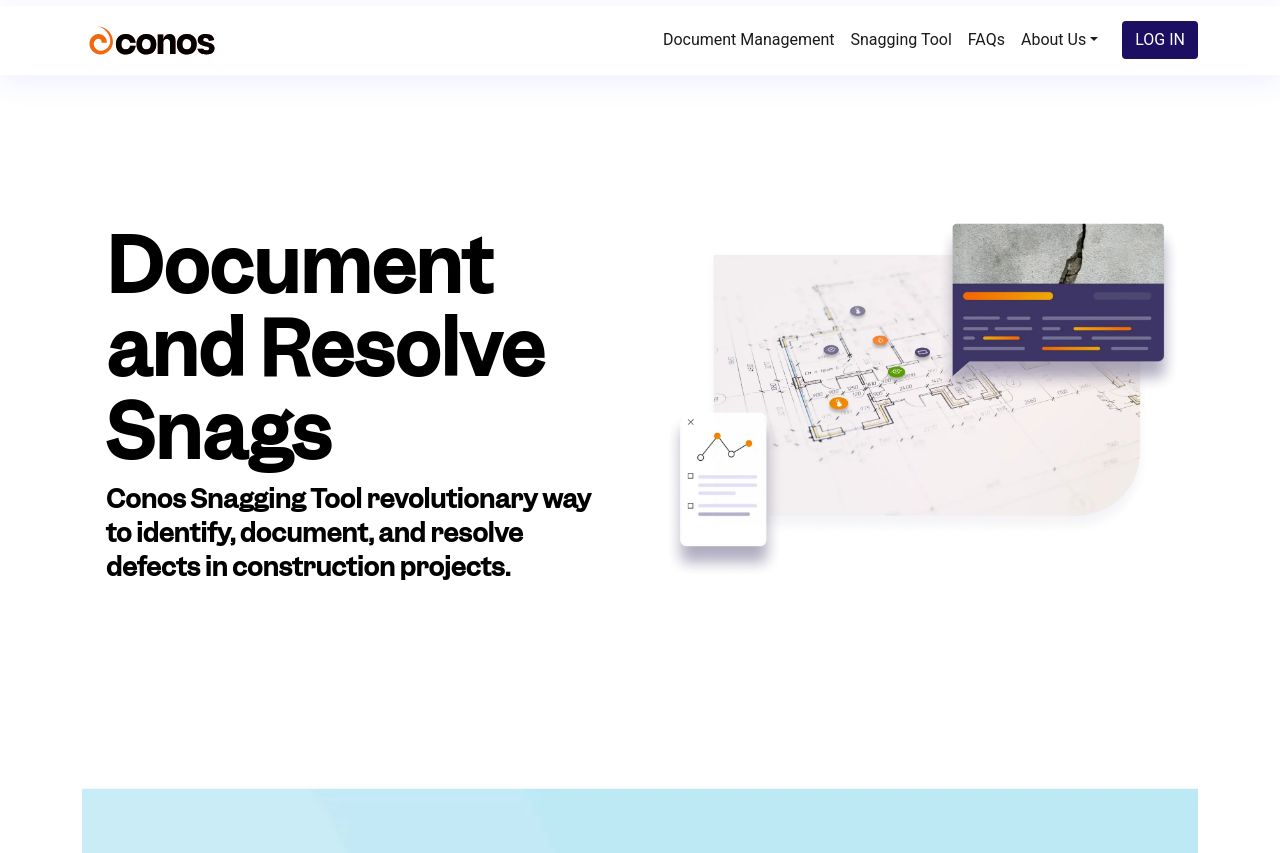
The Conos Snagging Tool landing page is a decent attempt but fails to really excite. The overall messaging might make sense for someone deeply familiar with construction management, but it doesn't hit hard enough for first-time visitors. The design is clean but lacks a bit of creativity and flair, leading to a somewhat static visual experience. Functionality and benefits get a fair explanation, but the text cramps its own style with long-winded and chunky paragraphs that don't keep attention well.
Color contrast is adequate, and the design doesn’t suffer from dreadful inconsistency but, somehow, it also doesn’t memorable standouts either. CTAs are meh—boring words on a page. No urgency or motivation to click—just a button that sits there.
On the social proof side, it’s a bit hit or miss. Testimonials and logos would really help add trust and credibility. Overall, it could certainly do with some tightening and energy to really sell its worth.
- Revamp the CTA text to be more compelling and action-oriented—try something like 'Start Your Free Trial Now!'
- Break up long paragraphs into bullet points or shorter sentences to improve readability and engagement.
- Add testimonials and recognizable client logos to build trust and credibility with first-time visitors.