rsvp101.com
Landing Page Analysis
Summary:
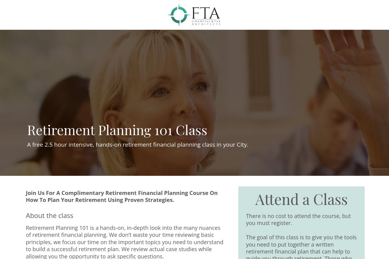
The landing page for the "Retirement Planning 101 Class" needs some attention. The value proposition is clear, offering a free class on retirement planning. However, it's a bit text-heavy, and the visuals are lacking, making it seem less engaging than it could be.
Design is uninspired, and the lack of imagery doesn't help in creating a connection. While the form and call-to-action are straightforward, they lack distinction against the background. The schedule section is plain and could use visual enhancement.
Structure-wise, the information is organized, but the reading flow feels flat due to the lack of visual breaks or engaging elements. The credibility aspect is fairly good, backed by the educational offer, but it lacks strong trust-building elements like staff credentials or testimonials.
- Enhance visual elements to make the page more engaging.
- Include testimonials or reviews to build trust.
- Improve the call-to-action visibility with color or design changes.