vercel.app
Landing Page Analysis
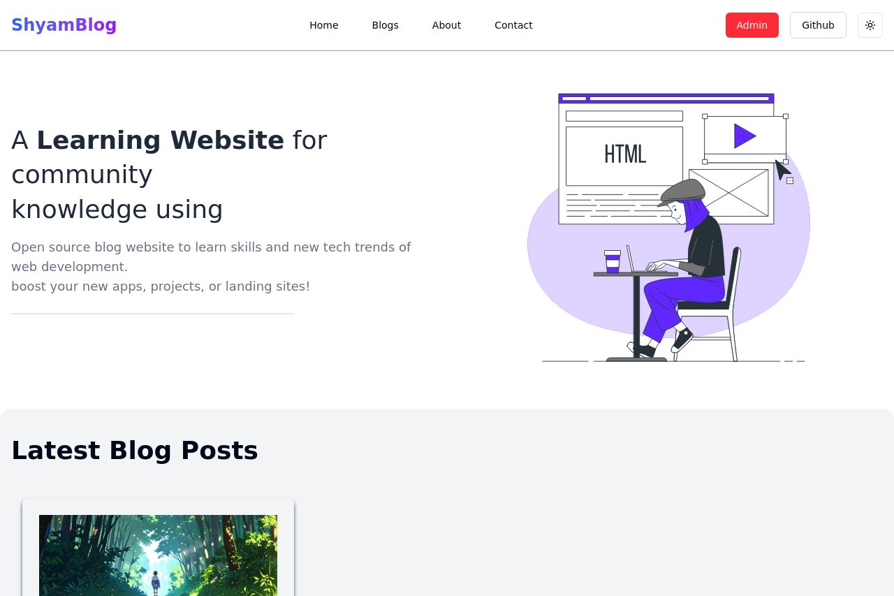
Shyam's Blog
Summary:
The page attempts to establish a learning environment for web development but lacks clarity in its messaging. There's a discrepancy between the bold "Learning Website" headline and the subsequent vague description, leaving users unsure about the actual offerings. The visual design is simple and uncluttered, which is good, yet the overall look is quite bland and uninspired.
Navigation seems straightforward at first glance but doesn't stand out. Meanwhile, the call to action is overshadowed and easily missed due to poor emphasis and placement. The blog section lacks content, failing to demonstrate real engagement or credibility, and no strong visual elements pull the visitor's attention. Overall, the site needs to articulate its value proposition more robustly and enhance its visual appeal to truly attract and retain visitors.
- Clarify the value proposition with precise language about the benefits and features.
- Enhance the visual hierarchy and color usage to make CTAs more visible and engaging.
- Add more engaging content or examples of previous blogs to establish credibility.