vercel.app
Landing Page Analysis
PORTFOLIO INCLUDING SKILLS AND PROJECTS
26
Share on:
Summary:
35
Messaging
20
Readability
30
Structure
30
Actionability
25
Design
10
Credibility
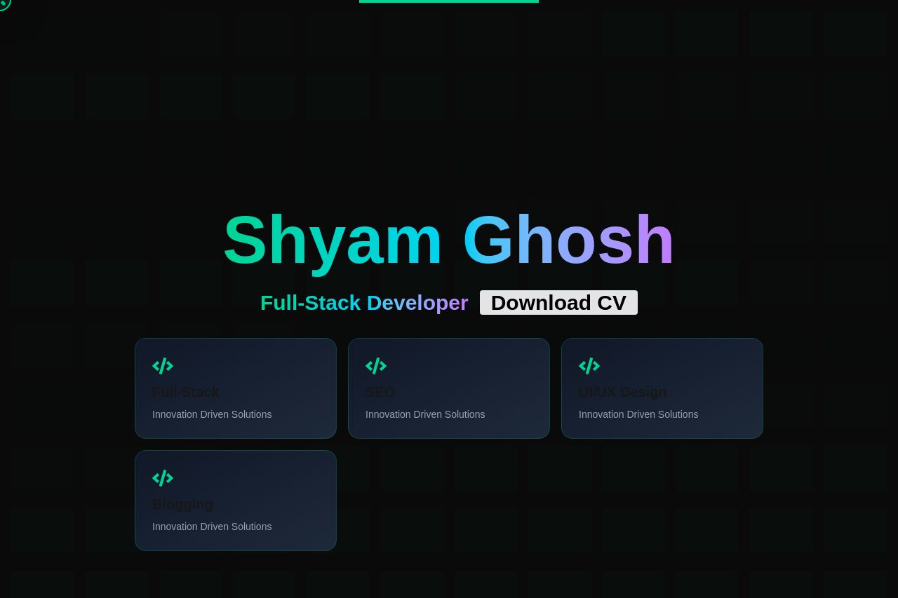
The portfolio tries to present important information such as skills and projects but suffers from major visual issues. The dark background combined with similar text colors makes readability a nightmare. The lack of proper contrast means users have to strain to read or even notice the key sections. The visual hierarchy is almost nonexistent, with titles blending into the background. Images and icons for projects and skills aren't helping to distinguish content either. The call-to-action button "Download CV" is there, but doesn't stand out. Overall, this design is holding back the content.
Main Recommendations:
- Increase contrast between text and background for readability.
- Use larger and more distinct headings to improve visual hierarchy.
- Ensure call-to-action buttons are prominent and engage users immediately.