trainingwithrokhsana.com
Landing Page Analysis
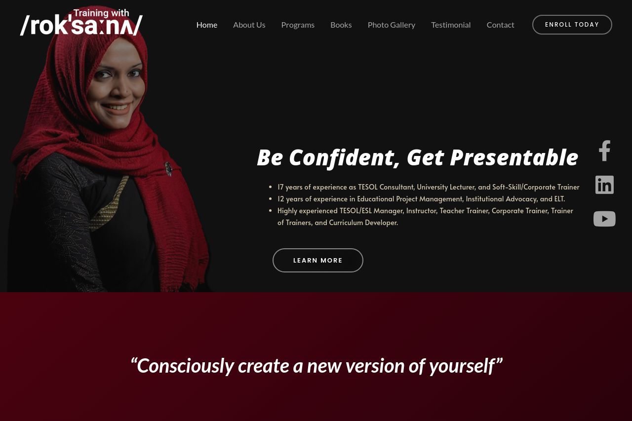
Rokhsana Akhter Rupee is a leading corporate trainer and best selling author in Bangladesh. She is the CEO of a renowned training and consultancy firm. Being elected as the first female district offic
Summary:
The landing page for 'Training with Rokhsana' has a strong personal brand presence, with a focus on Rokhsana's extensive experience and authority in TESOL and corporate training. This is well communicated with the use of images and credible information, which build trust effectively.
However, the visual design and readability are not the best. The layout feels cluttered with excessive use of dark backgrounds, which could affect readability for some users. The header section feels overwhelming with dense text, and there's a lack of visual break between sections to guide the user's eye naturally. The call-to-action buttons don't stand out as they should, making it easy to miss potential enrollment options.
For an audience of English learners, simpler language and clearer organization could improve engagement. Overall, while there's strong expertise displayed, the layout's readability and visual flow need refinement for better usability.
- Redesign the visual hierarchy to improve readability and guide the user’s eye more naturally.
- Create distinct, visually appealing CTAs to enhance actionability.
- Simplify language and reduce text clutter, especially in the hero section.