lovable.app
Landing Page Analysis
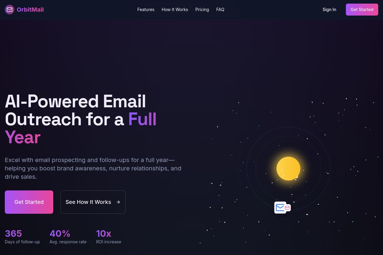
Excel with email prospecting and follow-ups for a full year—helping you boost brand awareness, nurture relationships, and drive sales.
Summary:
The landing page is visually attractive with a consistent dark theme and pleasant color contrast, but some areas need work. The hero section impressively communicates the value proposition with terms like "AI-Powered Email Outreach for a Full Year," well supported by a solid call to action. However, engagement metrics in the hero section may benefit from more elaboration. The design elements are creative, especially the solar system motif, which adds thematic richness to the content without being overly distracting. The breadcrumb navigation is clear but could be more engaging. The page organization is logical, flowing from features to pricing, but the value of the features section could be elevated with clearer descriptions of benefits. "How It Works" is informative but laid out in a way that feels static. Pricing is direct but visually heavy, making comparison difficult at a glance. Calls to action in the footer feel repetitive. Some sections are bland, not exploiting the lively visual elements across the rest of the design.
- Elaborate on the engagement metrics to provide specific value to prospective users.
- Enhance the visual comparison of pricing options for easier decision-making.
- Tweak CTAs to reduce redundancy and increase motivation and urgency.