quickreadme.com
Landing Page Analysis
AI-powered README generator
Summary:
QuickReadme's landing page does several things right but also misses some opportunities for optimization.
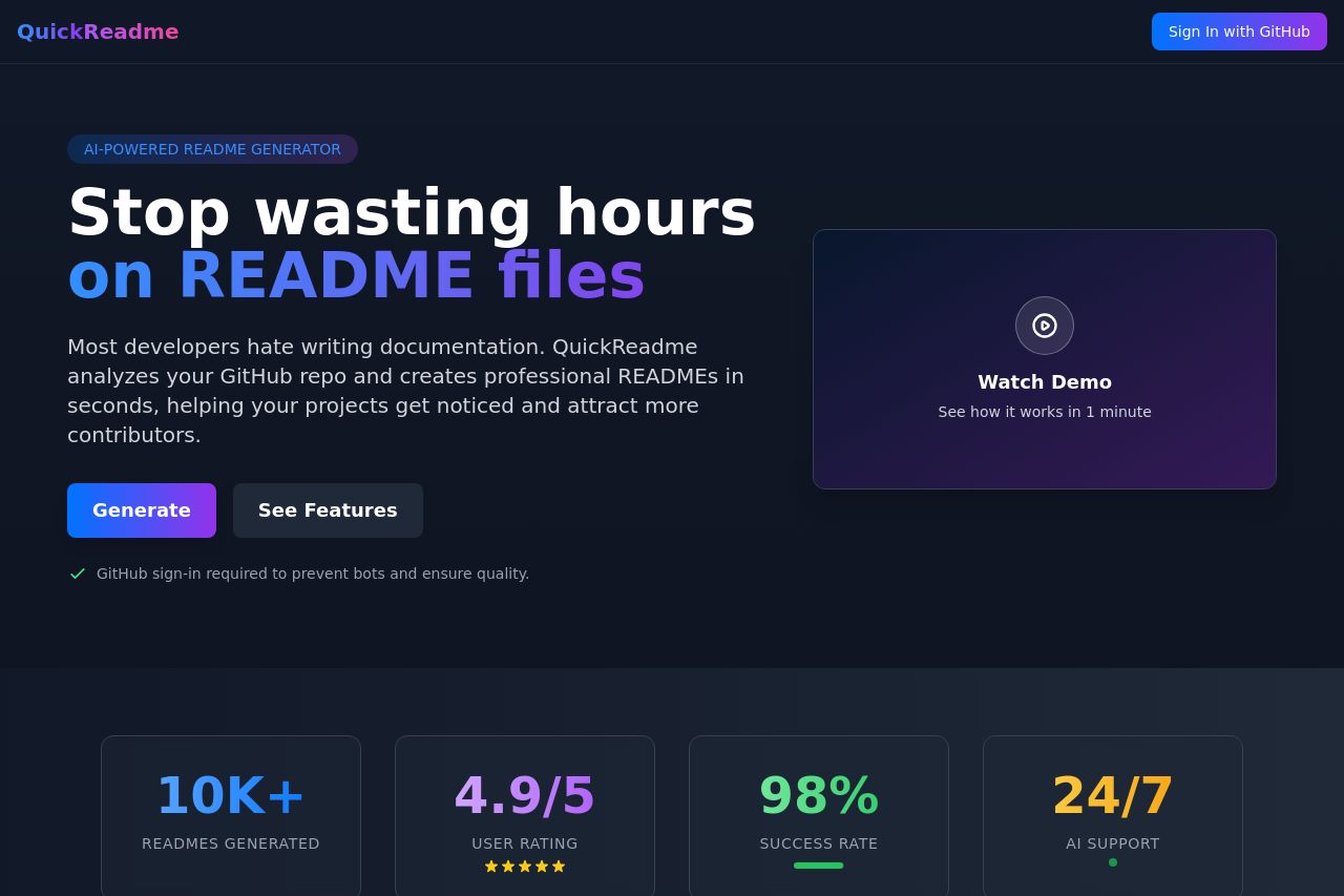
The Hero Section clearly communicates the main value proposition and encourages action, which is excellent. The statistics on README files generated and the user rating provide strong social proof. However, the reliance on visuals for the demo with no direct written alternative could alienate potential users who prefer written content. The Features Section shows good use of descriptive titles and benefits, emphasizing the product's strengths, but lacks the same punch in explaining unique selling points that differentiate it from competitors.
The Testimonials Section also adds credibility but could do better by including more diverse perspectives or quantitative results to enrich reader understanding of the benefits. The Pricing Section's dual choice is smart, especially with the bold discount, but the style doesn't leverage urgency or scarcity tactics adequately.
Design-wise, the page is refined with cohesive colors and consistent layout, helping readability and flow. However, both navigation and CTA placements are an area that could be improved. The call to action buttons have action-oriented text but could stand out more. Overall, it's functional but not as engaging as it could be, especially for a B2B audience seeking efficiency and clarity.
- Add a written alternative to the demo video explaining the process succinctly.
- Incorporate more diverse testimonials with specific quantitative results.
- Enhance the urgency in the pricing section with time-limited offers or stock alerts.
- Highlight CTAs using more contrasting colors or a different placement strategy.