landinganalyze.com
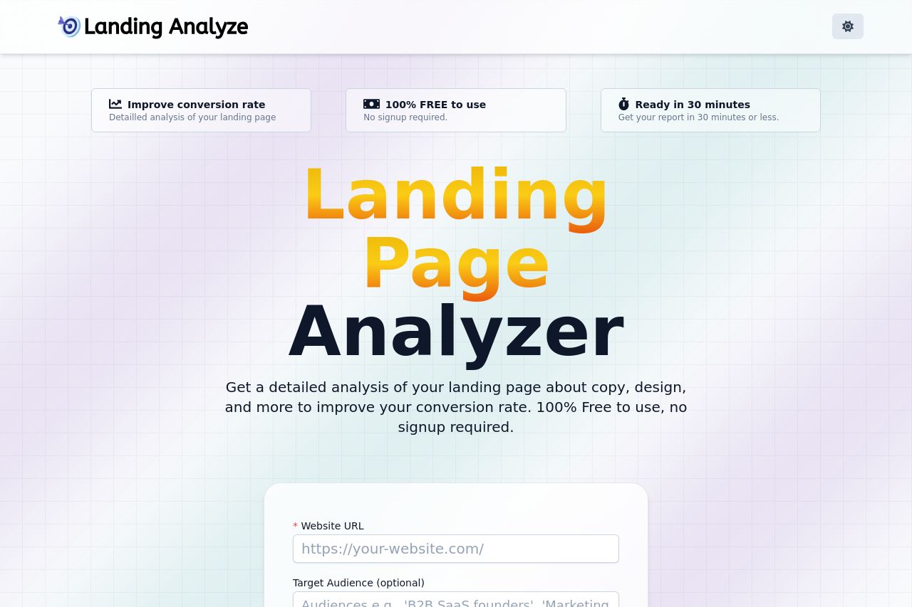
Landing Page Analysis
Get a detailed analysis of your landing page about copy, design, and more to improve your conversion rate. 100% Free to use, no signup required.
Summary:
The landing page for Landing Analyze is a mixed bag of strengths and weaknesses. The design is relatively modern and uses a clean color palette, which is beneficial for readability and professionalism. However, the overall layout is a bit messy, with inconsistent visual hierarchy making it hard to understand the primary message quickly. The value proposition of offering a free landing page analysis tool is enticing, but it's not conveyed immediately in a powerful way. The tone of voice is straightforward but lacks the necessary engagement to really connect with the audience. The actionability is where it falls short the most: CTAs are poorly placed and not prominent enough to catch a user's attention effectively. Thankfully, the credibility is quite high due to the professional design and presence of trust indicators like testimonials.
- Reorganize the page to establish a clearer visual hierarchy. Emphasize the value proposition right from the start with stronger, more engaging headlines.
- Improve Call-To-Action placement by using contrasting colors and making them more visually appealing. They should be prominent and immediately noticeable.
- Make use of whitespace to aid in better readability and create a more inviting reading flow.