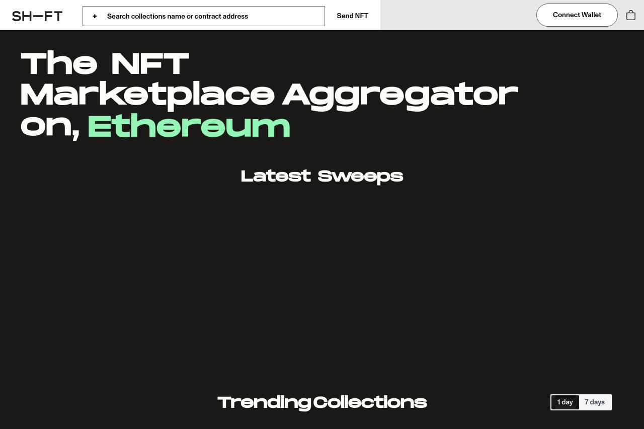
shift.lol
Landing Page Analysis
NFT marketplace aggregator. Sweep Arbitrum marketplaces like Trove. More Soon

Summary:
The landing page for this NFT marketplace aggregator tries to capture the NFT-centric audience relying on Arbitrum. The main value prop is clear, but the lack of engaging text and uninspiring visuals make it feel more like a grind than a grab. The "Latest Sweeps" and "Trending Collections" sections are overloaded with data without a meaningful design hierarchy, making the page appear cluttered. There’s some credit for maintaining a consistent color scheme, but it's too flat, lacking any exciting or inviting elements. Credibility efforts seem half-hearted due to missing critical trust indicators like testimonials. Overall, the page could use stronger elements to connect with its target audience and elicit more excitement around using the platform.
- Enhance the visual hierarchy by using varied font sizes and weights to differentiate key elements.
- Add testimonials or user reviews to boost credibility and trust.
- Improve Open Graph data for better shareability and click-through rates.