vercel.app
Landing Page Analysis
Barcelona Product Community - Events, articles, and resources for product managers and tech professionals in Barcelona.

Summary:
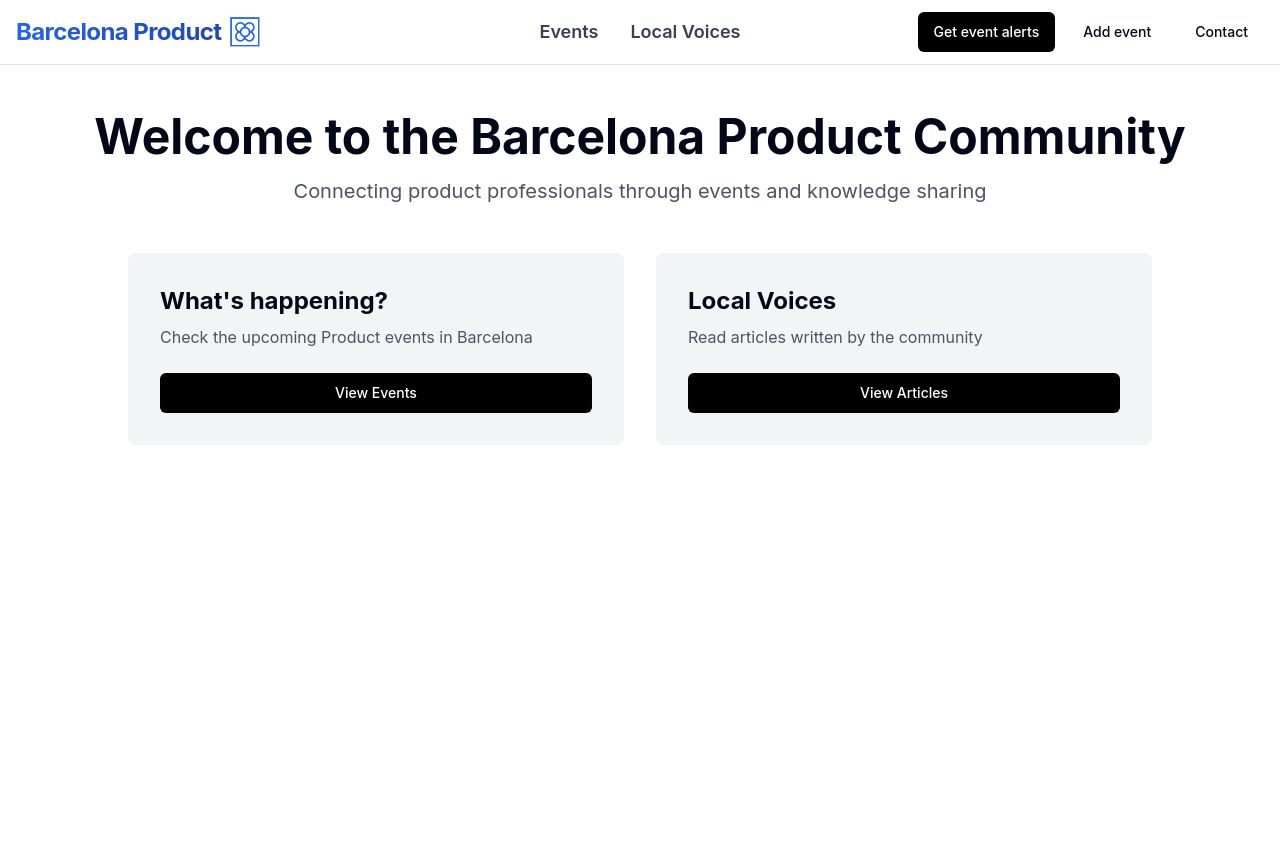
The landing page for the Barcelona Product Community is straightforward but lacks a strong impact. The headline does make it clear that the site is meant for product professionals, but the rest of the messaging is quite generic. There's a noticeable lack of detailed information about what specific events or articles might be available, which would engage product managers looking for targeted insights. The design is minimalist, with sufficient whitespace ensuring clarity, but it feels uninspired. The call-to-action buttons stand out but are basic and don't create urgency or excitement. While the page is neat and easy to navigate, it doesn't provide any strong incentives or motivations to explore further.
Overall, it's serviceable for those who stumble upon it, but there's nothing to actively draw users in or compel them to engage with the community. It doesn't speak to the audience in a way that conveys expertise or value.
- Add specific details about the upcoming events or articles to attract and engage the audience.
- Enhance the visual appeal with more dynamic graphics or imagery related to product management.
- Refine the call-to-action buttons with more compelling verbs or phrases to boost click-through rates.