predictmodel.net
Landing Page Analysis
Protect your enterprise network with continuous vulnerability scanning. Trusted by Fortune 500 companies for real-time threat detection and prevention.
Summary:
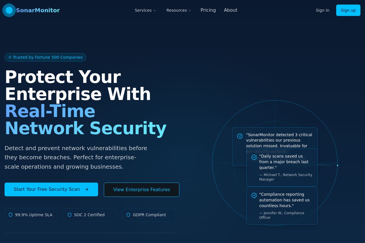
The landing page for SonarMonitor is strong in terms of professional design and clear value proposition. The main headline is bold and instantly communicates the service focus: "Real-Time Network Security." The use of social proof with company logos and customer testimonials adds credibility. However, there's a lack of visual variety, and the text-heavy sections could benefit from breaking up with more visuals or graphics to retain user interest. Call-to-action buttons are prominent but could be enhanced with more urgency or a better placement strategy. Furthermore, the form section comes off as monotone and needs a more engaging design to drive conversions.
- Add more visuals or graphics to break up text-heavy sections and maintain user interest.
- Create urgency in the call-to-action by adding time-sensitive language or offers.
- Improve form design by adding visual elements or unique styling to make it stand out more.