pipeorganmap.com
Landing Page Analysis
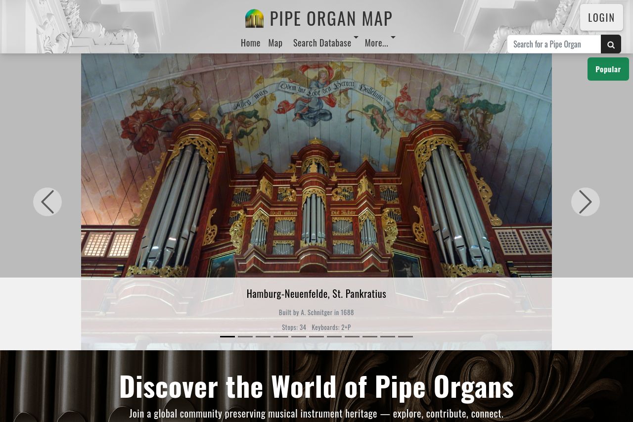
Discover and explore pipe organs around the world with our free interactive map and growing database. View stoplists, photos, recordings, and builder info — and help us build the world's most comprehe
Summary:
This landing page does a solid job in introducing the concept of exploring pipe organs globally. The headline "Discover the World of Pipe Organs" is clear, and the call-to-action "Start Exploring the Map now" is visible. However, it lacks a strong visual impact or engaging design elements that could grab more attention. The typography is simple but doesn't take full advantage of visual hierarchy, which makes it appear a bit flat. The imagery could tie in more seamlessly with the site's theme, and while there are examples of organ locations, more interactive previews are needed to captivate users.
The storytelling and testimonials add credibility but could be sharper in tone. The testimonials are numerous and detailed, which adds authenticity but may overwhelm users on the first impression. The design and structure are clean but could focus more on guiding the user through a journey rather than just listing features. CTAs could be optimized for better engagement, and some design consistency issues with typography and color prevent the page from coming together as a cohesive user experience.
Overall, the page serves its purpose in providing extensive information on pipe organs, but with tweaks in its visual and messaging elements, it could improve user engagement substantially.
- Enhance visual hierarchy by emphasizing key sections with varied typography and strategic use of color.
- Integrate more interactive elements or video demos to engage users with the content.
- Simplify and clarify calls-to-action for better user guidance through the site.