lovable.app
Landing Page Analysis
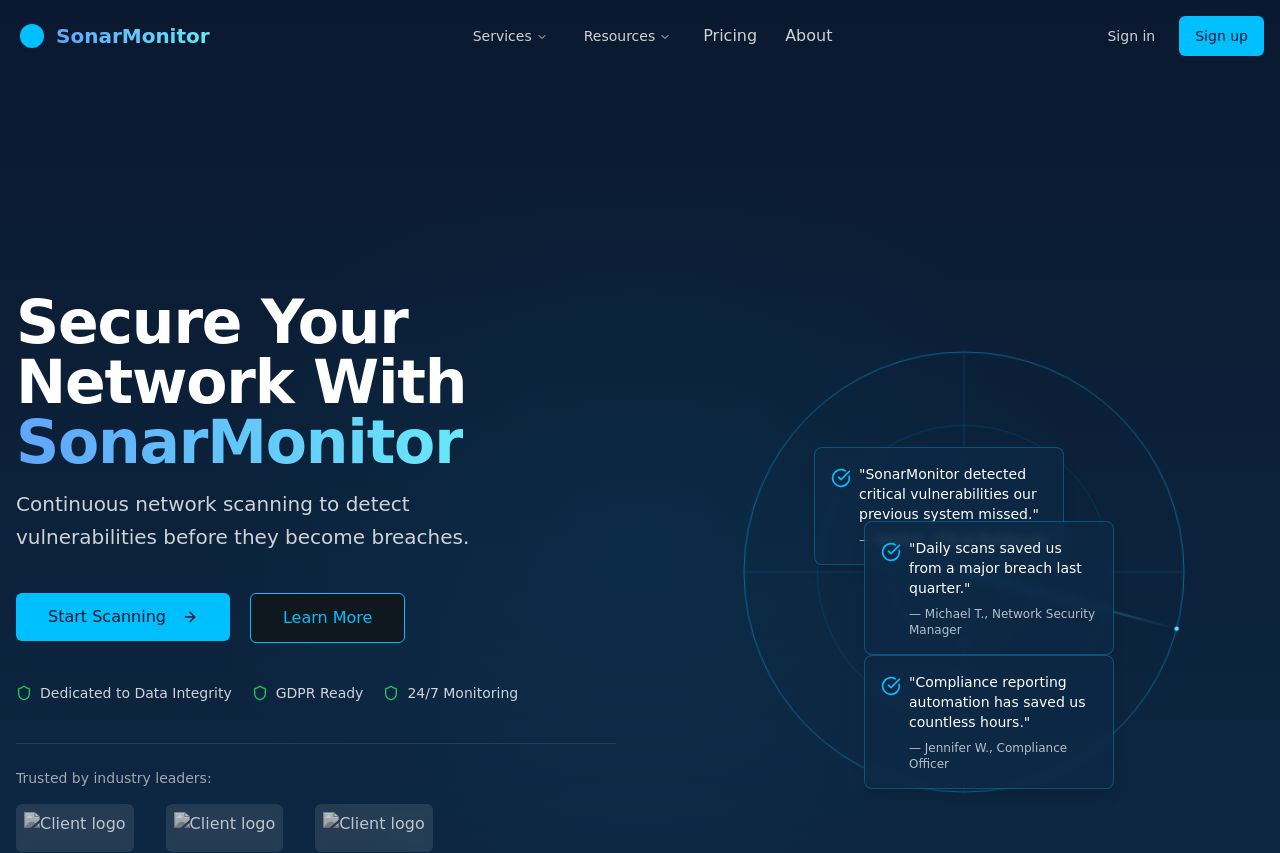
Advanced network security scanning to detect vulnerabilities before they become breaches
Summary:
The landing page attempts to communicate its purpose clearly, highlighting continuous network security scanning. Good use of color contrast with the blue tones enhancing brand consistency and readability, easily guiding the eye. The layout is structured logically, following a typical user journey from features to form completion. However, the messaging lacks depth in targeting a specific audience, missing explicit mentions of different user levels, which dilutes its potential impact. CTAs are visible but could be more action-oriented to invoke stronger urgency or curiosity. Testimonials are somewhat generic and could benefit from richer client details. Visual elements are appropriately supportive but could have been better used to showcase product benefits more dynamically. Lastly, additional social proof and clearer use cases would solidify trust and convince prospects better, ensuring alignment between product capability and user needs.
- Clarify target audience specifics directly in the value proposition.
- Enhance CTAs with stronger action verbs and urgency.
- Include detailed client testimonials or recognizable logos for social proof.