predictmodel.net
Landing Page Analysis
Lovable Generated Project
Summary:
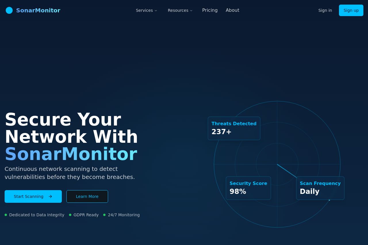
Overall, the SonarMonitor landing page comes off as clean and fairly professional, but suffers from several shortcomings.
The hero section succeeds in communicating the main value proposition, "Secure your network with SonarMonitor," effectively, but more emphasis on the unique benefits would elevate it further.
The design uses visual hierarchy well, with good contrast between the blue call-to-action buttons against the dark background, making them notable without overwhelming the content.
However, the readability could be improved. Although the text is simple, some sections appear a bit cramped, especially where text and visuals are closely aligned without enough spacing. The font size, color, and style are used consistently but can be perceived as somewhat monotonous, lacking any distinctive character the brand could own.
The aesthetic and functional design aspects do ensure clarity, but the actual CTA placement could be optimized to guide users more effectively through the buying process.
The credibility score suffers due to the absence of any significant social proof or trust indicators. There's no inclusion of client logos or recognizable partnerships, which could otherwise hugely substantiate the brand's trustworthiness.
The Open Graph data is dreadful—a generic "Lovable Generated Project" fails to entice users to click or provide any insight into what SonarMonitor actually does.
- Incorporate social proof such as testimonials or recognizable client logos.
- Revise the Open Graph description for a more intrigue-generating line that's relevant to SonarMonitor.
- Improve typographical consistency to maintain engagement without becoming bland.