predictmodel.com
Landing Page Analysis
Lovable Generated Project
Summary:
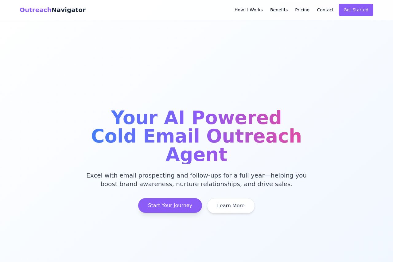
OutreachNavigator's landing page tries to make a strong impression with a bold display and clear layout. The main value proposition is clear but lacks depth, and while the main headline is large and colorful, it doesn't fully engage with the target audience. The design is clean but somewhat plain, lacking a distinct flair that would make it memorable. The imagery is repetitive, especially the funnel graphic, causing the sections to blend into one another without distinctness. However, there is a consistent use of colors and typefaces, helping with navigation. Some text lacks engagement because it feels generic, and the call-to-actions (CTAs) could use more urgency and prominence. The structure is overly reliant on the funnel image, which is dull after the first viewing. Pricing is straightforward but doesn't stand out visually. Overall, the page functions but lacks a compelling, standout quality.
- Enhance the uniqueness of each section to reduce monotony, especially with graphics.
- Improve CTA urgency and make them stand out more from text blocks.
- Add more engaging, targeted language to connect better with specific audiences.