nuxflare.com
Landing Page Analysis
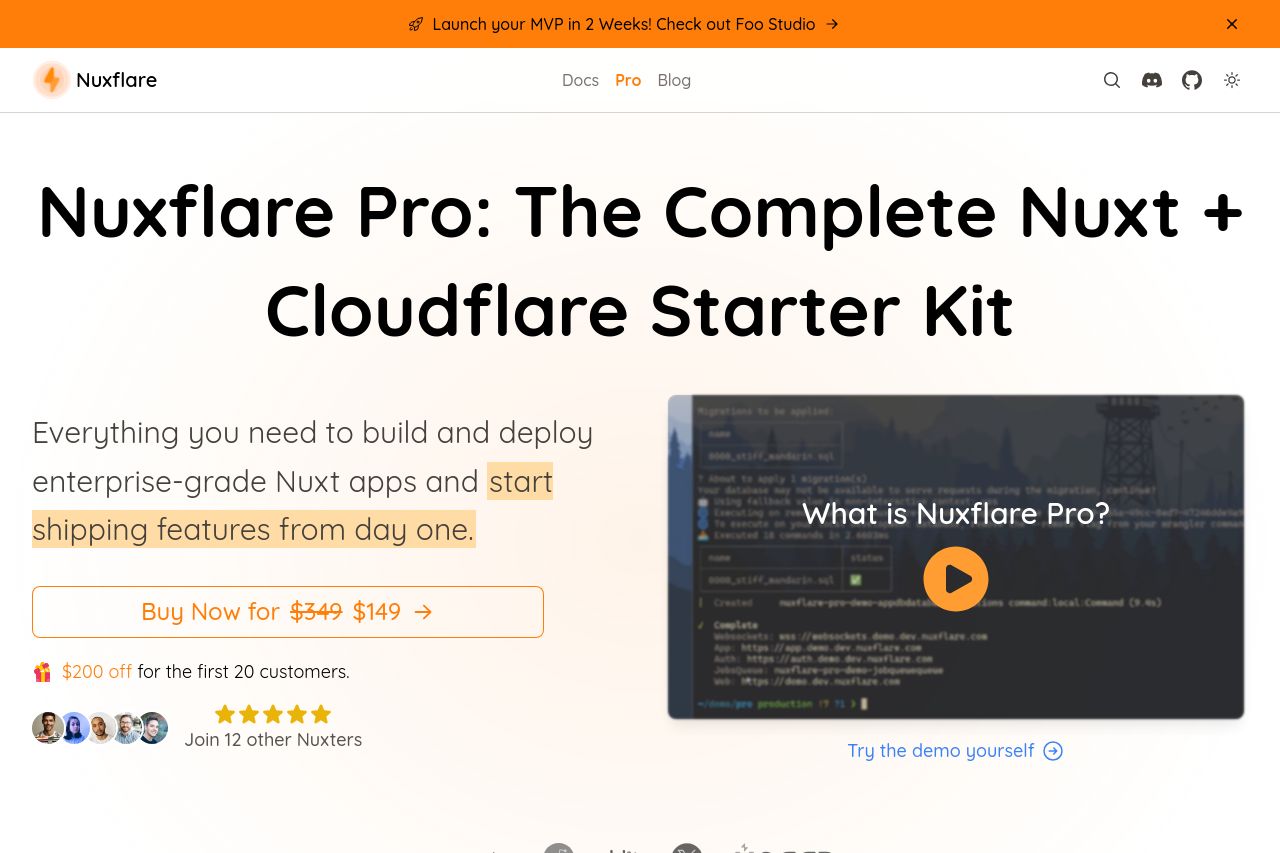
Production-ready Nuxt starter kit with Cloudflare integration. Includes D1 database, Durable Objects, team authentication, RBAC, payments, and automated deployments - everything you need to build and
Summary:
The landing page effectively communicates its value proposition and streamlines information for potential users looking to deploy Nuxt applications with Cloudflare integration. There are clear examples, graphical explanations, and a coherent design that stays consistent across different sections. Social proof is heavily used throughout, giving a sense of trust and credibility. The color scheme is appealing but could use more contrast to highlight key actions better.
However, the page could benefit from more targeted content specific to the audience, such as showcasing more in-depth use cases or case studies. The layout, while clean, is a bit text-heavy and might overwhelm some users. The CTA could be more prominent, and scarcity elements should be utilized more effectively.
- Increase contrast on CTAs to make them stand out more.
- Include more specific use cases tailored to early-stage startups.
- Simplify some text to improve readability and avoid overwhelming the user.