bannertize.com
Landing Page Analysis
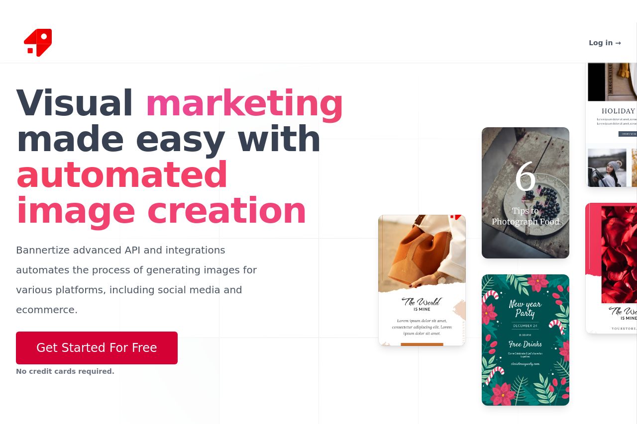
Visual marketing made easy with automated image creation.
Summary:
Bannertize's landing page does a solid job of grabbing initial attention with a clear value proposition. The headline immediately conveys the main offering - automated image creation for visual marketing. The call-to-action "Get Started For Free" is enticing and repeated appropriately, and the lack of "credit card required" lowers barriers to entry. However, the design is cluttered with inconsistent color use, especially in the hero section which results in a lack of visual harmony.
On the readability side, while the text is straightforward, the lack of hierarchy and excessive block text in the testimonial section could deter engagement. The "How it Works" section lacks clarity due to repeated text and feels redundant. Integrations are well laid out, but the details are text-heavy and could benefit from more engaging visuals.
Credibility is somewhat reinforced with testimonials and integrations, yet lacks professional polish in displaying recognizable client logos or partnerships. The transparency is lacking without a clear contact or about section.
Overall, while the page has strengths in messaging and call-to-action strategy, it could be greatly improved with enhanced design consistency and a more streamlined information flow.
- Enhance visual hierarchy by using consistent colors and font sizes for headings and subheadings.
- Minimize text blocks in the testimonials section to improve readability and engagement.
- Increase visual clarity by using more engaging visuals in the Integrations section.