keyboardspa.com
Landing Page Analysis
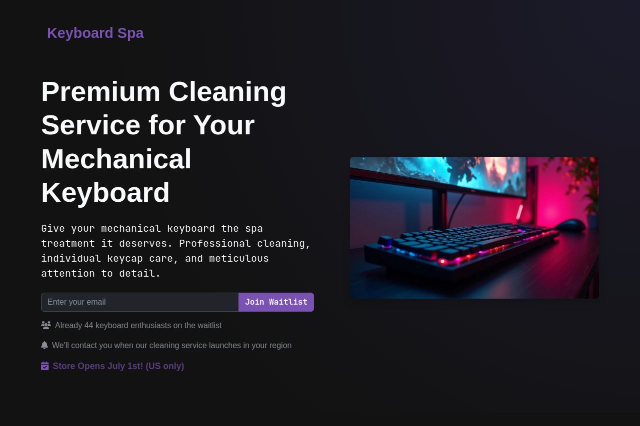
Give your mechanical keyboard the spa treatment it deserves. Professional cleaning, individual keycap care, and meticulous attention to detail.

Summary:
This landing page does a great job of appealing to keyboard enthusiasts by clearly communicating a unique service: a spa-like cleaning for mechanical keyboards. The main headline is bold and directly addresses the target audience, aligning with their niche interests. However, it's not perfect. The design, while visually appealing, lacks hierarchy in some areas, making it harder to guide users naturally through the page. The call-to-action buttons stand out, but their placement could be more strategic to capture user interest effectively in each section. Moreover, the lack of social proof is a major weakness—there are no testimonials or recognizable logos to establish trust. Overall, clean design and direct messaging make it appealing, but it needs improvement in terms of credibility and strategic CTA placement.
- Add testimonials or client logos to increase credibility.
- Improve CTA placement throughout the sections for better engagement.
- Strengthen visual hierarchy by better organizing content and using varying font sizes.