vg.no
Landing Page Analysis
Siste nytt hvert minutt på Norges største nettsted. Nyheter fra Norge og verden, sport og underholdning.
72

Share on:
Summary:
70
Messaging
60
Readability
70
Structure
50
Actionability
60
Design
100
Credibility
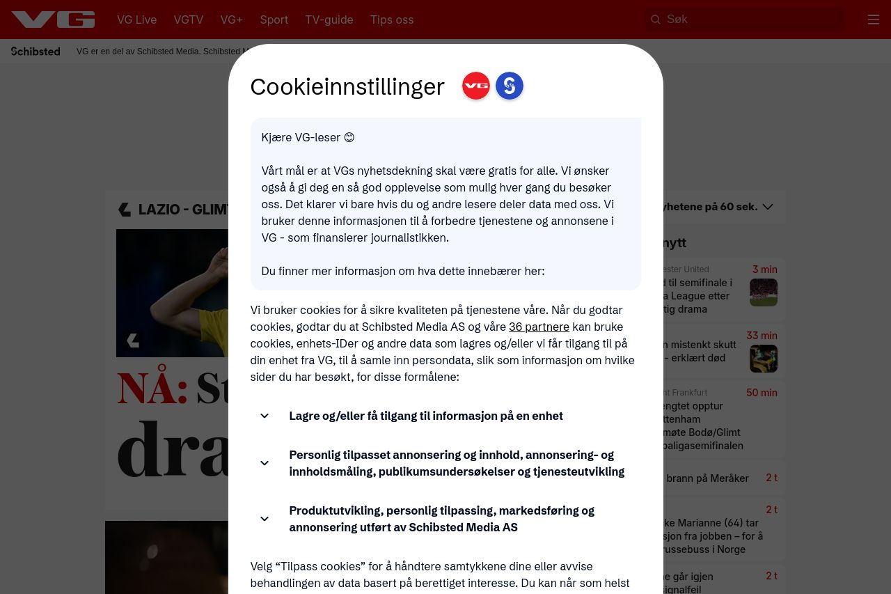
VG’s homepage attempts to pack a punch with visual impact but overdoes it to a point that it becomes a bit overwhelming. The typography is strong and large, ensuring visibility, but it creates a cluttered and chaotic feel. The headlines scream for attention, but the lack of a clear visual hierarchy makes it hard to focus on what’s important. The cookie consent banner is intrusive. It's a necessary evil, but it disrupts the user experience tremendously. The layout overall is typical for a news site, but without the finesse of balanced spacing and visual guidance, it just becomes a splash of noise.
Main Recommendations:
- Reduce clutter by creating more visual breathing room and clear hierarchy.
- Modify the cookie banner to be less disruptive to the browsing experience.
- Balance typography sizes on headlines to improve readability and focus.