helpdesktech.support
Landing Page Analysis
PredictModel - Tech Support Assistant We're here 24/7 to help with any troubleshooting or technical guidance you need. For assistance you can click the microphone icon to speak in any language, or typ
Summary:
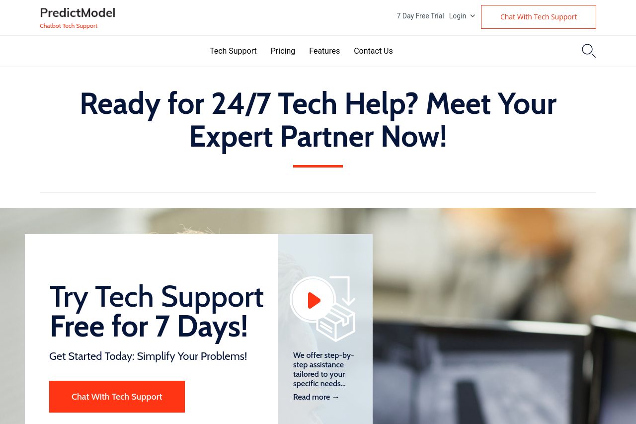
The page has a clear overall theme focusing on 24/7 tech support, emphasized through repeated mentions of availability and expert assistance. However, the design is a mixed bag. The color scheme is consistent, yet not particularly engaging or inspiring; it lacks popping elements that catch the eye.
The messaging on the site is decent, with a clear value proposition, but it tends to be generic. The phrase "Meet Your Expert Partner Now!" is dynamic, but there's room for more specificity, especially around highlighting unique benefits. The readability is fair, but overly lengthy blocks of text could deter users. Design elements are generally aligned well, but some sections feel overly crowded and lack whitespace for breathability.
Structure-wise, the sections logically follow each other, yet some content seems irrelevant or overly familiar for an already knowledgeable audience. CTAs are bold and strategically placed but tend to be repetitive. The site's credibility is fairly supported through testimonials and basic contact details, but lacks richer content or diverse trust signals that could elevate trustworthiness.
- Provide more specific examples or testimonials to enhance credibility and authenticity.
- Break down text into bullet points or shorter paragraphs to improve readability.
- Enhance CTAs by varying the wording to avoid repetitiveness.