helpdesktech.support
Landing Page Analysis
PredictModel - Tech Support Assistant We're here 24/7 to help with any troubleshooting or technical guidance you need. For assistance you can click the microphone icon to speak in any language, or typ
Summary:
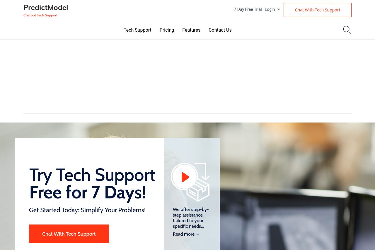
The page has a clear overall theme focusing on 24/7 tech support, emphasized through repeated mentions of availability and expert assistance. However, the site suffers from excessive text clutter, inconsistent calls to action, and an overwhelming amount of content packed into sections.
The hero section loudly declares constant support availability but lacks more engaging visuals that could enhance the appeal. The repetition of similar CTAs dilutes their effectiveness; "Chat With Tech Support" and "Claim My 1 Month Free" both seem to compete for attention without a seamless journey. While the service descriptions are overly text-heavy, they successfully convey the range of offerings. However, specific benefits, previews, or user testimonials presented here are underwhelming. The use of language is straightforward, but some parts are littered with technical jargon, potentially alienating less tech-savvy users. Design consistency takes a hit with color schemes that lack harmony, and visual hierarchy could be better commanded to direct the user’s eye.
Overall, the site makes an honest attempt at clarity but trips over its own information density and somewhat dated aesthetic.
- Reduce text clutter and break up large text blocks with visual elements.
- Unify and simplify CTA text to avoid confusion and enhance user journey.
- Revamp color scheme for greater consistency and better visual hierarchy throughout the site.