helpdesktech.support
Landing Page Analysis
PredictModel - Tech Support Assistant We're here 24/7 to help with any troubleshooting or technical guidance you need. For assistance you can click the microphone icon to speak in any language, or typ
Summary:
The page has a clear overall theme and structured layout, aiming for a professional look. The top portion communicates its value proposition with a prominent call to action for a 7-day free tech support trial, which is strong. However, this offer conflicts later on with "1 Month Free", creating confusion. The color scheme is clean and consistent, utilizing a predominantly white background with colored accents for visual appeal. Visual hierarchy is established but could be improved in sections like service offerings, where there's a lot of text, leading to potential overwhelm. The typography is readable but overly uniform, lacking emphasis on key points. The chat section is engaging but blends in too much, not standing out as a unique interactive element. The language section is awkward, seems displaced, and might not be immediately intuitive to users. Testimonial sections try to build trust but are too wordy, and images lack diversity. Actionability suffers from multiple similar CTAs, causing user distraction. Finally, while the site looks credible, the lack of specific company details initially could raise trust issues.
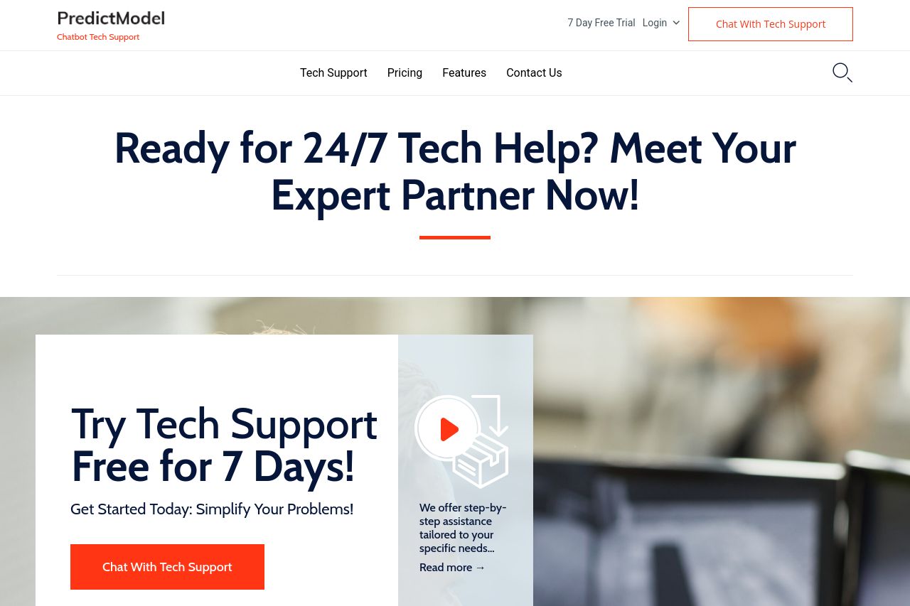
- Clarify the offer: Is it a 7-day or 1-month free trial? Consistency is key.
- Improve CTA visibility and diversity—use varying verbs and placement.
- Revise the language section to be better integrated and more intuitive.