mailchi.mp
Landing Page Analysis
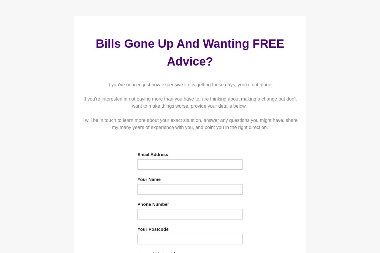
If you've noticed just how expensive life is getting these days, you're not alone. If you're interested in not paying more than you have to, are thinking about making a change but don't want to make
Summary:
This landing page struggles with clarity and engagement. The headline is a bit vague, and while offering "FREE Advice" might catch some attention, it lacks a strong value proposition that explains exactly what users are signing up for. The text tries to empathize with the audience by discussing the rising costs, but it doesn't establish credibility or trust.
The design is overly simplistic and lacks visual appeal. The "Register My Interest!" button is lost in the monotony, and there's no visual elements to guide the user's attention. The form fields are functional but uninspired. Overall, the page fails to motivate users to complete the form, lacking urgency, trust signals, and a clear sense of purpose.
- Clarify the value proposition with a specific benefit statement, like how the advice will specifically help reduce bills.
- Add testimonials or trust badges to establish credibility and encourage sign-ups.
- Improve the CTA by making it more engaging, such as "Get My Free Advice Now!" to create urgency.