arztbrief.ai
Landing Page Analysis
Arztbrief diktieren und Zeit sparen

Summary:
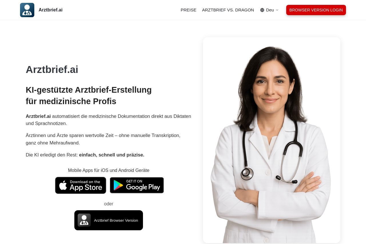
The landing page for Arztbrief.ai does a decent job at presenting the product, aimed at medical professionals, through clear messaging and visible CTAs. However, the overall execution leaves much to be desired.
The value proposition is clear but could be more engaging. The repetition of core benefits helps reinforce the message, yet it could benefit from examples or case studies. The alignment with a medical audience is decent; however, some more advanced insights would better meet expert needs.
Readability is largely upheld, though some sentences could be simplified to enhance accessibility. The text layout seems plain, and the font choices come across as generic, which might undermine engagement. Consistency in design is moderately achieved, though the site feels a bit too basic and uninspired. While the structure logically orders information, some crucial content is downplayed, which could affect conversion rates.
Call-to-actions are scattered and lack urgency or uniqueness, which diminishes immediate engagement. Boosting credibility requires more visible trust elements, despite existing testimonials. Beyond the testimonial section, there's a lack of strong professionalism and transparency signals.
- Enhance the value proposition with use cases or case studies specific to medical practitioners.
- Revise the CTA wording for more urgency and action-oriented language.
- Introduce more advanced information or services tailored for professional medical users.
- Improve the design's cohesivity and attractiveness to align better with a high-end professional aesthetic.