jingsourcing.com
Landing Page Analysis
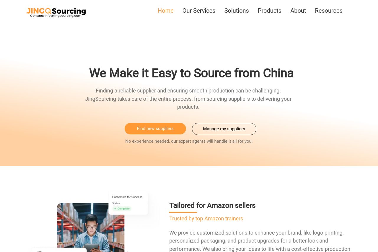
Help you find best price factory in China, followup production, ensure quality. One-stop service for Amazon Sellers. 4,000+ happy clients.
Summary:
JingSourcing's landing page does a good job of getting to the point—sourcing from China seems easy and accessible here. The value proposition is clear right at the top, aiming directly at businesses looking to source efficiently from China. However, the page could benefit from a stronger call to action (CTA) strategy. It feels like "Get started" is just tossed around without connecting deeply with the user's needs at each section. There's some variety in design and decent social proof, but the sections are somewhat repetitive. The design employs a consistent color scheme, yet it feels somewhat bland and lacks a clear visual punch. The typography is clean, but fails to emphasize key points due to its lack of hierarchy. Credibility-wise, they've nailed it with client logos and numbers which imply trust, but the page still feels templated, missing an opportunity to truly stand out. Overall, the page hits the basics but lacks differentiation, a more aggressive CTA, and dynamic design to truly engage visitors.
- Rework CTAs to be more specific to the section's content, e.g., instead of 'Get started', use 'Explore Our Tailored Solutions'.
- Enhance visual hierarchy with more varied heading sizes and weights to draw attention to key points.
- Incorporate more engaging visuals or infographics to break up the text and add interest.