replo.app
Landing Page Analysis
62
Generated on:
April 17, 2025Score:
62/100Audience:
ecommerceShare on:
Summary:
40
Messaging
80
Readability
70
Structure
45
Actionability
60
Design
60
Credibility
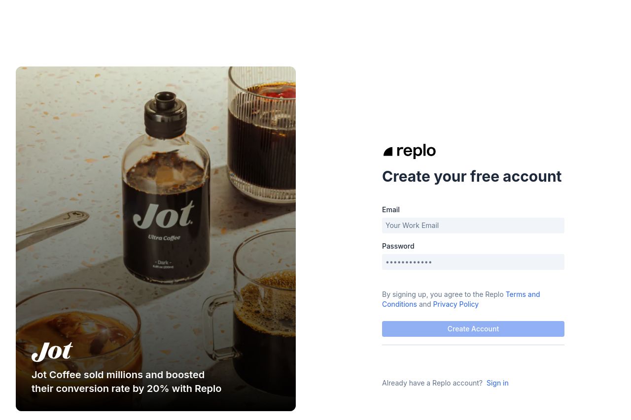
The page presents a clean and professional design, but lacks a strong value proposition. The left side shows an image of a coffee brand, Jot, which is somewhat engaging but not fully connected to the primary action of the page: signing up for Replo. The credibility badges below demonstrate some trust, although they are quite small.
On the right side, the sign-up form is straightforward but lacks excitement or any compelling reason to create an account. The call to action, "Create your free account," is clear but not particularly motivating. The use of color is minimal, which keeps the design simple but risks becoming bland and uninspiring.
Main Recommendations:
- Increase the size of credibility badges for better visibility.
- Add a more compelling value proposition to the signup form area.
- Inject more personality or urgency in the text to enhance interest and engagement.