gr-site.com
Landing Page Analysis
Home
Summary:
This landing page has some good aspects but is largely falling short in multiple areas.
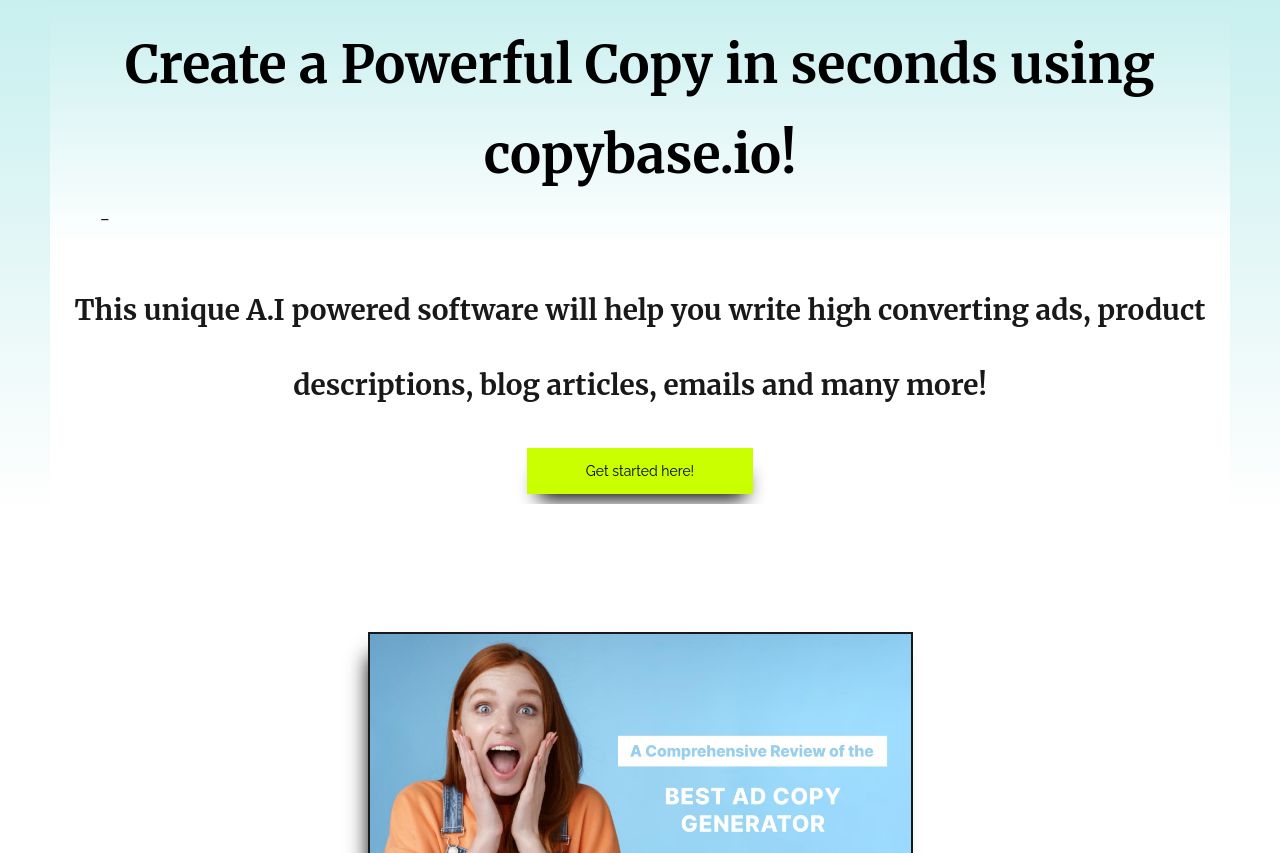
The value proposition is somewhat clear about offering AI-powered copywriting, but it feels generic. The benefits and features aren't communicated effectively—relying heavily on repeating the basic message without diving deep into differentiated perks.
The design and readability have major issues. The typography is basic, which is fine, but the layout is too plain and uninspired, lacking distinctiveness. There's some inconsistency across the page and clear misses in visual hierarchy, notably with the plain background and fonts that don't accentuate the message.
The CTAs are uninspiring. Phrases like “Get started here!” lack punch and don't effectively stand out. There’s a decent amount of trust elements like testimonials and a money-back guarantee, but the layout presentation makes them feel like an afterthought.
With structure, the information hierarchy fails to emphasize the critical details properly. Sections like the FAQs are necessary but come off as overly simplistic without solid attraction to further engage users. The navigation doesn't let one easily jump from one interest point to another.
Overall, while the intentions and basic structure are there, the execution is sub-par and lacks the finesse needed to truly convert visitors.
- Refine and bold the main value proposition to emphasize uniqueness.
- Work on the design elements such as colors and typography to create stronger visual hierarchy.
- Enhance the CTA text and positions to stand out more and drive action.
- Add more engaging elements or demos to demonstrate product functionality.
- Reorganize information for better flow and logical engagement.